UNIBUI
DELIVERABLES
UX strategy
User flows
Wireframes
User Experience
User Interface
ROLE
UX lead
Unibui is a platform built to benefit college students, offering them exclusive online/offline discounts and promos. It also provides a marketplace for students to buy from and sell to their peers on campus. Since its launch in early 2018, It has been adopted by local colleges and businesses around the bay area and is fastly expanding nationwide.
I have designed the visual and experience of the website to make it a delighting product for both types of its users (students and business owners). This post is mainly about the student side of the product (know more about my process designing Unibui Business here).
Define Visual Style
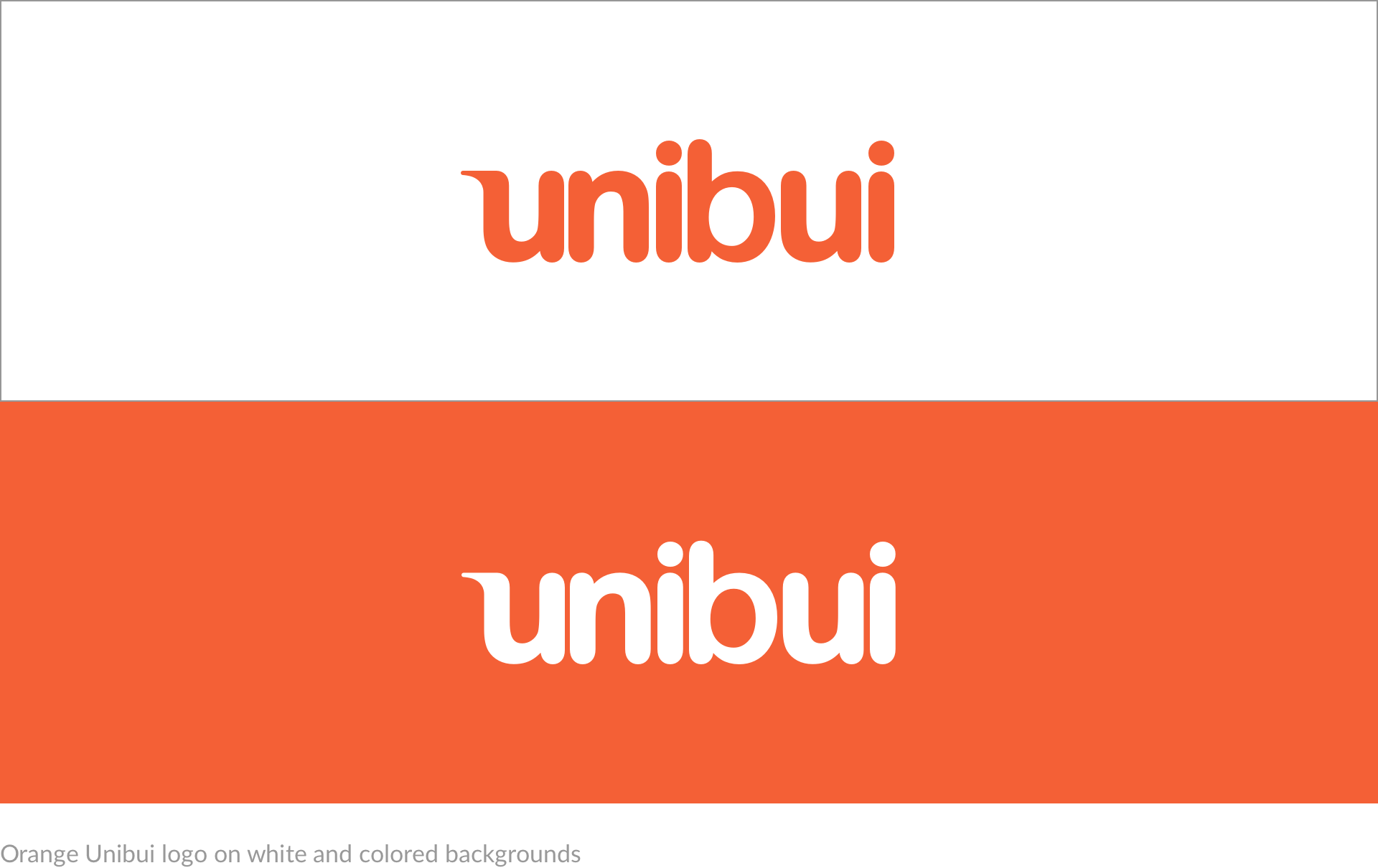
When I first joined the team and started to work on the project, we already had a nice wordmark logo, lowercase UNIBUI in a blue rounded font. We believed this logo was a good starting point to convey our young and active brand image for its soft shape.
About the color, I thought our current blue color is a good one in terms of its characteristic color values. But blue is not the correct color we want as our primary color. We considered using a warmer color as the primary color to highlight our brand image and use blue as the secondary color. After trying a few warm colors, we finally chose an orange, which contrasts and fits well with the blue at the same time.
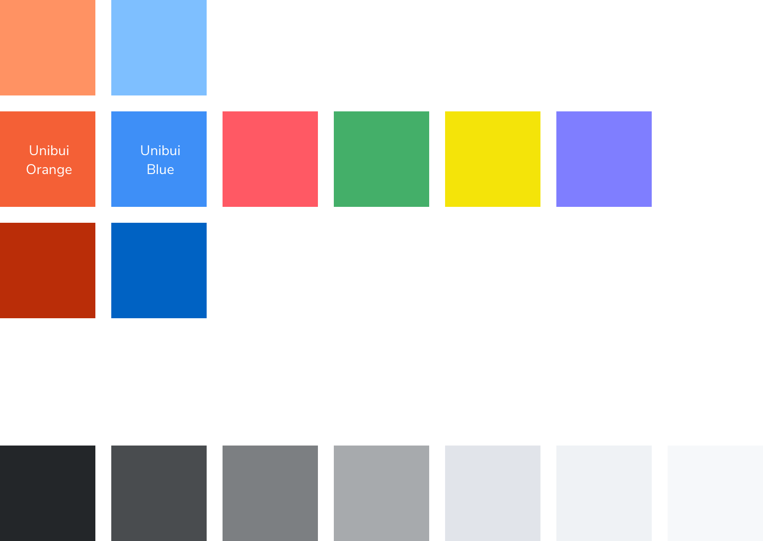
I used tools like paletton.com to create a color scheme. We wanted a young and active feeling, so I ended up with a palette of 6 colors, orange, blue, red, green, yellow and purple. Since we are more a user-generated content platform and barely generate any content on our own, we don't need a lot of variations of these colors in our handy color palette. Finally we have only 3 oranges, 3 blues (our primary and secondary colors), 4 supporting colors and a series of gray shades for text, lines and borders. I also used some online tools to test the accessibility of these colors.
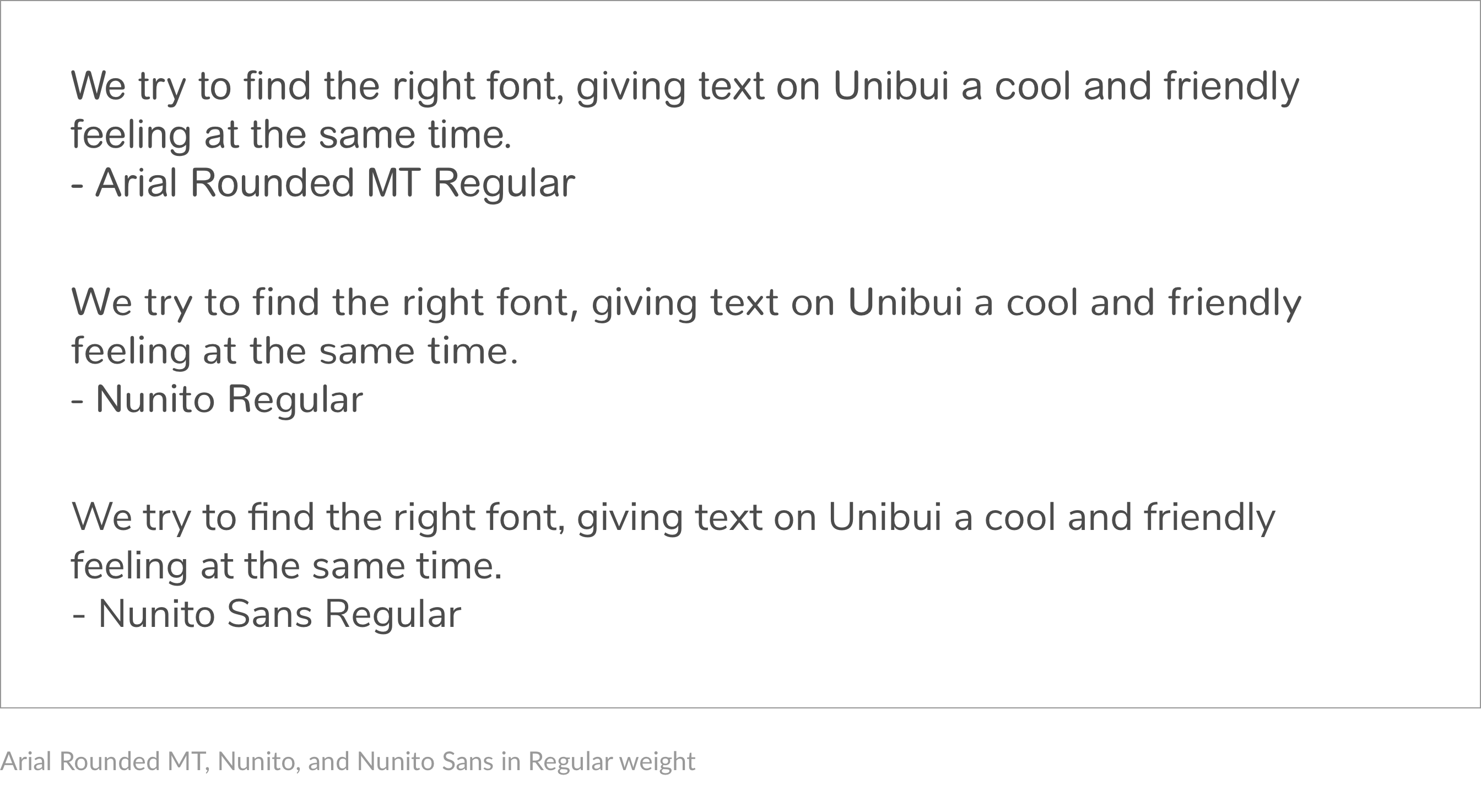
Our current wordmark logo is designed based on the font Arial Rounded MT Bold, so I was thinking about using the font family as the font on our site. Knowing that Arial Rounded MT does not offer a rich variety of font weights, I turned to find some fonts with a similar feeling. Then we found Nunito, a similar font with rounded corners and terminals.
However, after testing with real contents, we found nunito is more like a "display font" for titles and taglines rather than a "text font", for its rounded terminals limit its flexibility when adjusting font weights. It looks bolder than other fonts under the same font weight. Also the rounded font looks a bit too "cute" and soft when displaying large paragraph of text.
Finally we chose Nunito Sans, the non-rounded terminal version of Nunito. We found it suitable for both display and text purpose. The feeling it gives is also more balanced from "cute" to "cool" compared to its rounded brother.
Sensible bold weights gave us sleek taglines; regular and light variants allowed us to make the best use of limited space. Not long after the decision was made, we put Nunito Sans to work across the site.
Navigation
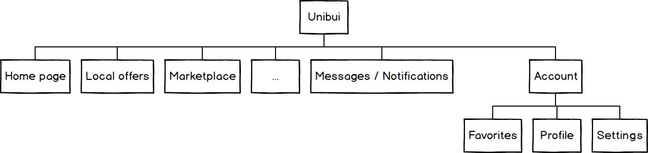
The first thing we did to design the site was to establish an organized hierarchy, based on which we can then outline the interactions for the specific features. It was an easy decision to choose a horizontal nav bar as our primary way to navigate the site for its easiness and familiarity over other ways of navigation, as well as the flat and spread information architecture.
Based on our needs, we sketched and mocked up dozens of layouts in an effort to clearly organize between our features, and provide enough compatibility for future features and actions. After sketching, designing mockups, and iterating and polishing directly in the code, our final version looked like this:
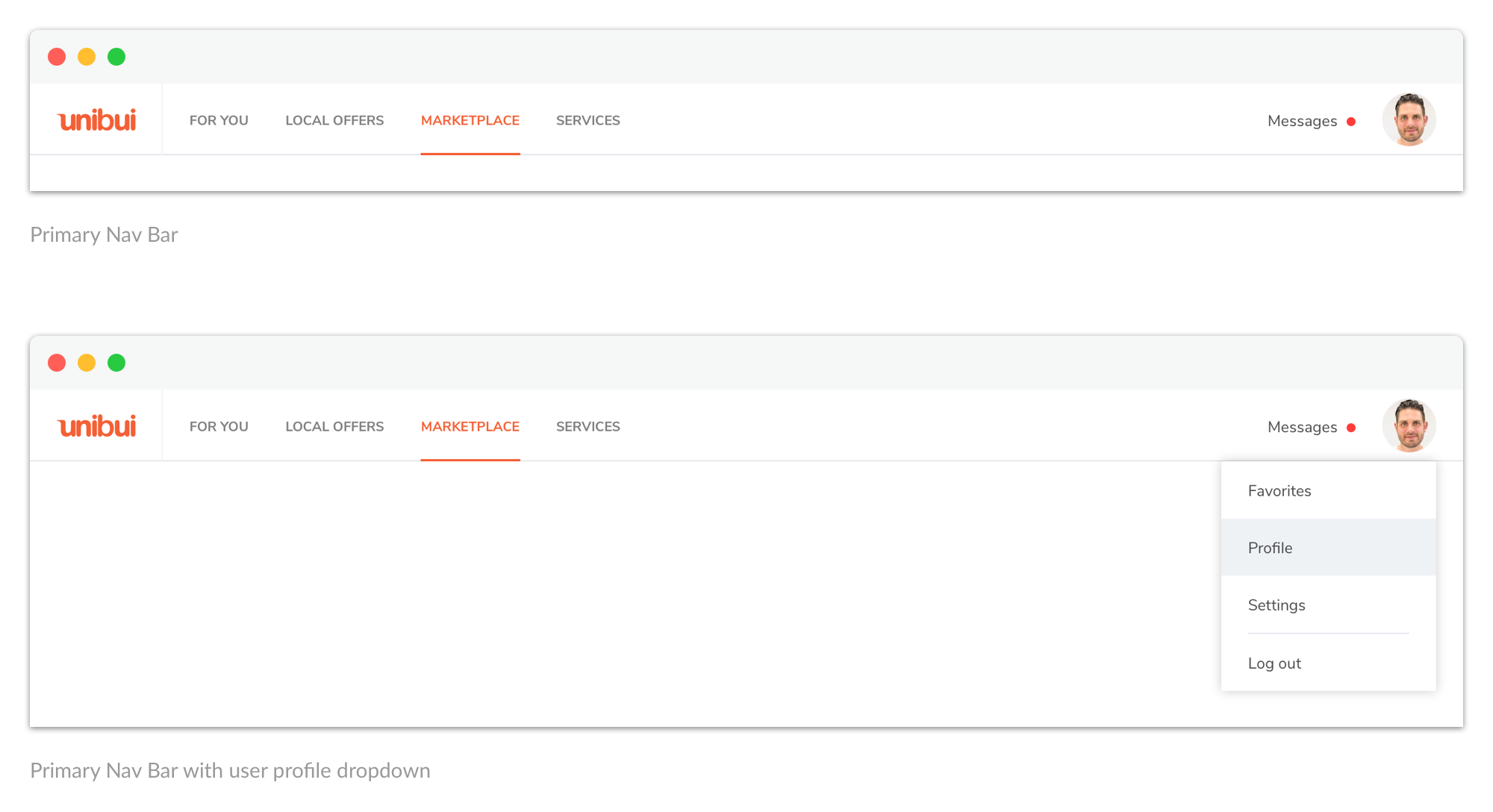
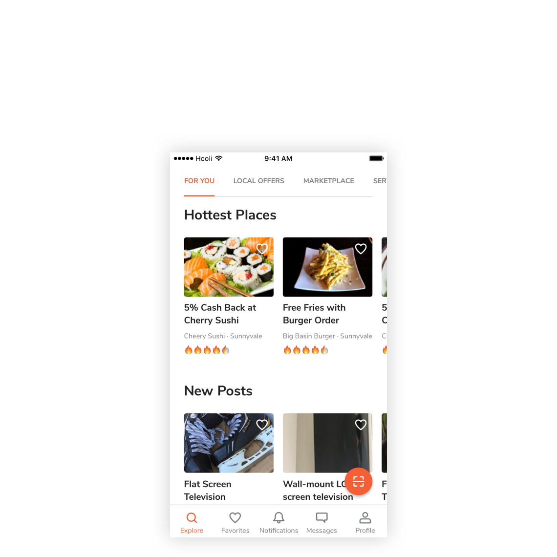
We listed all our top-level content categories as tabs in the primary nav bar for users to easily switch between. We put the user avatar and system messages at the right corner as an entrance to all sections about the user (profile, settings, favorites, notifications, and messages).
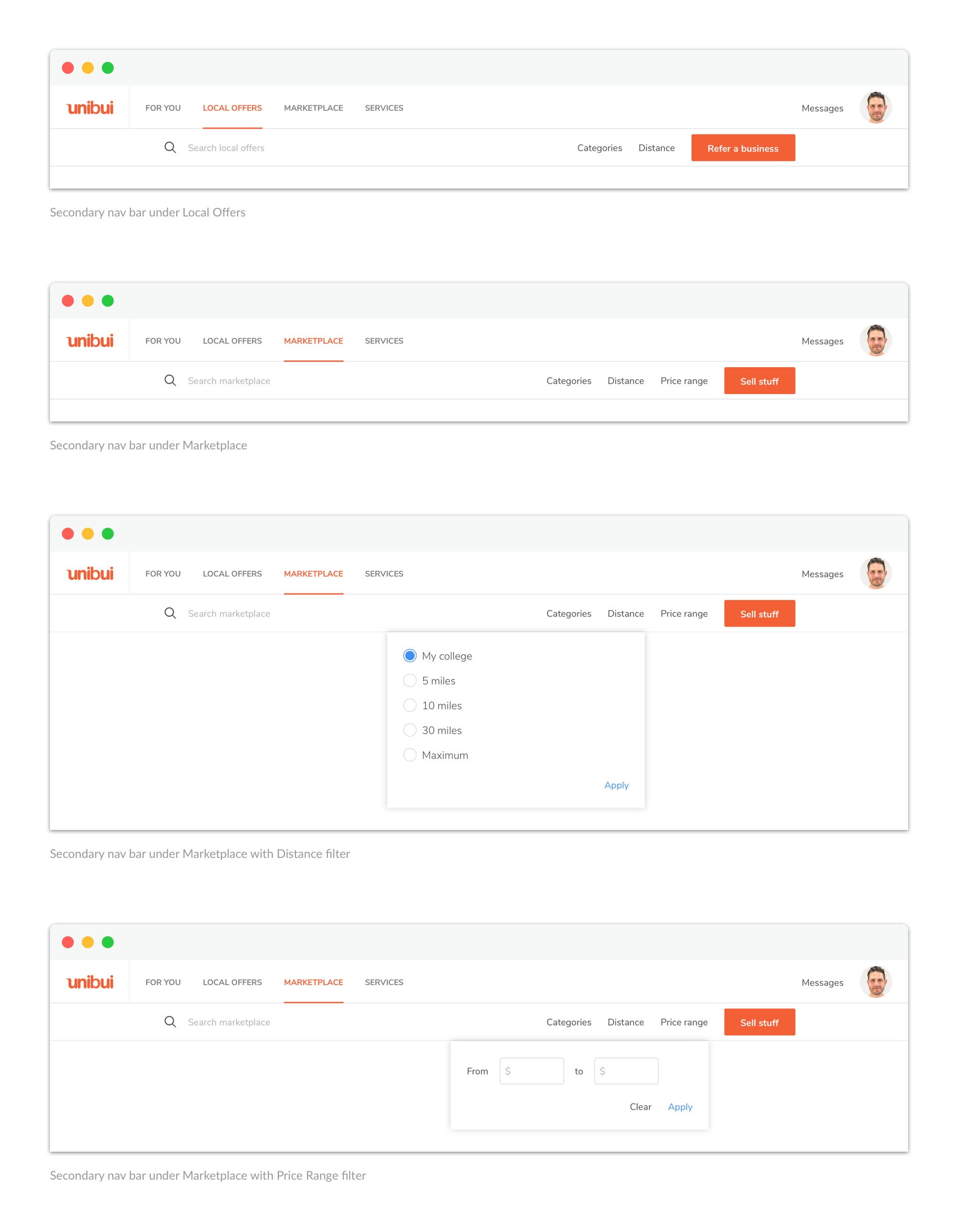
If needed, we can also add a secondary nav bar at the bottom of the primary one. It could contain a search field, some filters, and maybe a primary action button:
Second Hand Stuff
vs.
Discount Coupons
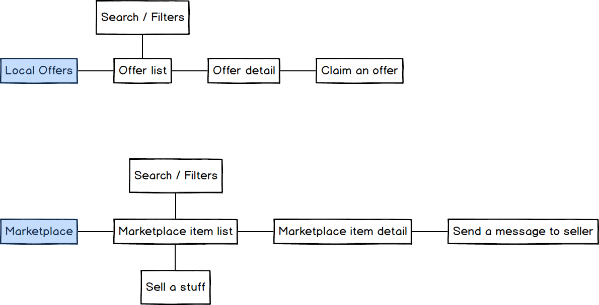
When designing the sections under Local Offers and Marketplace, we found the architecture of both sections pretty similar. So we decided to work on the two sections at the same time while comparing them throughout our process to make specific adjustments for both.
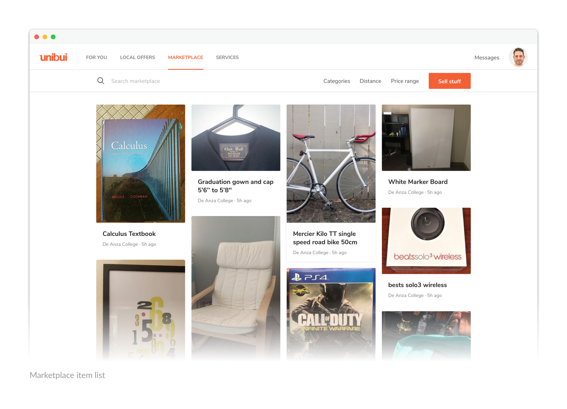
The contents on our site can be roughly divided into 2 main types: business contents (discounts and promos) and user-generated contents (marketplace items). When iterating how to display the contents in a list, we were choosing between an infinite waterfall flow layout and an identical-sized grid layout.
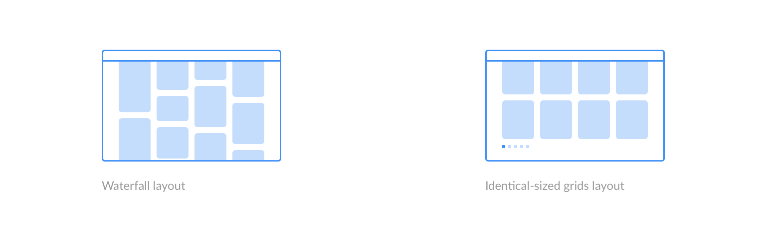
Finally, we chose to use the identical-sized grids to display more polished and formatted business contents, while using a waterfall flow (content-determined card size) for user-generated contents. We made the cards of both list layouts into same visual style (content hierachy, spacing, shadow) to give them a consistent look on full screen view.
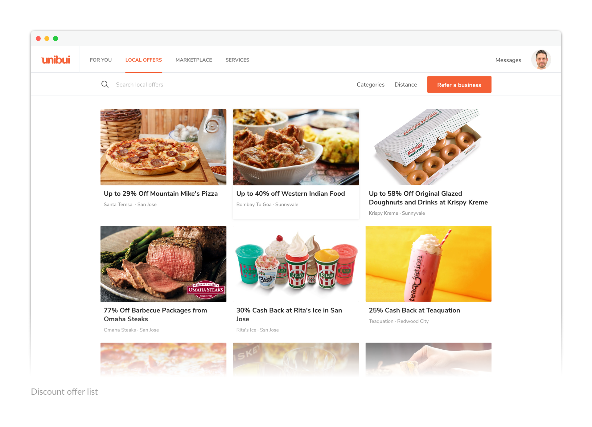
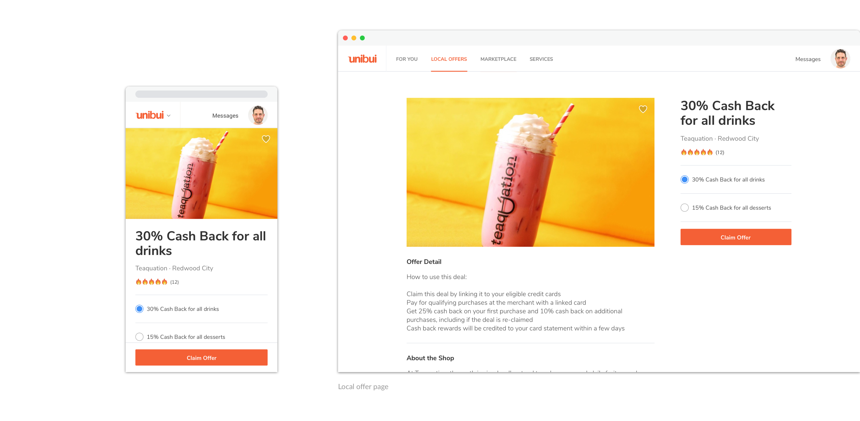
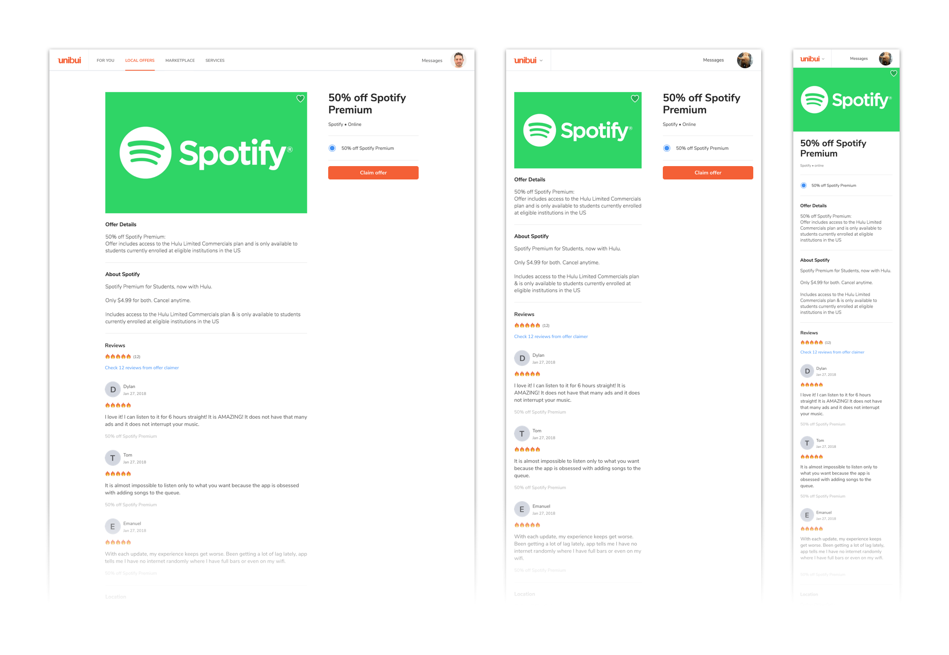
Offers on Unibui are info-rich. They include offer pictures, offer detail, business info, offer locations and reviews. So we decided to provide a single page for each business to showcase their offers. Users can check the details about an offer and start the offer claiming flow from here.
A majority of offer claims would happen on the mobile version of the site before our native app comes out, so we have kept the mobile usage in mind and made sure that the design is responsive to accommodate user needs.
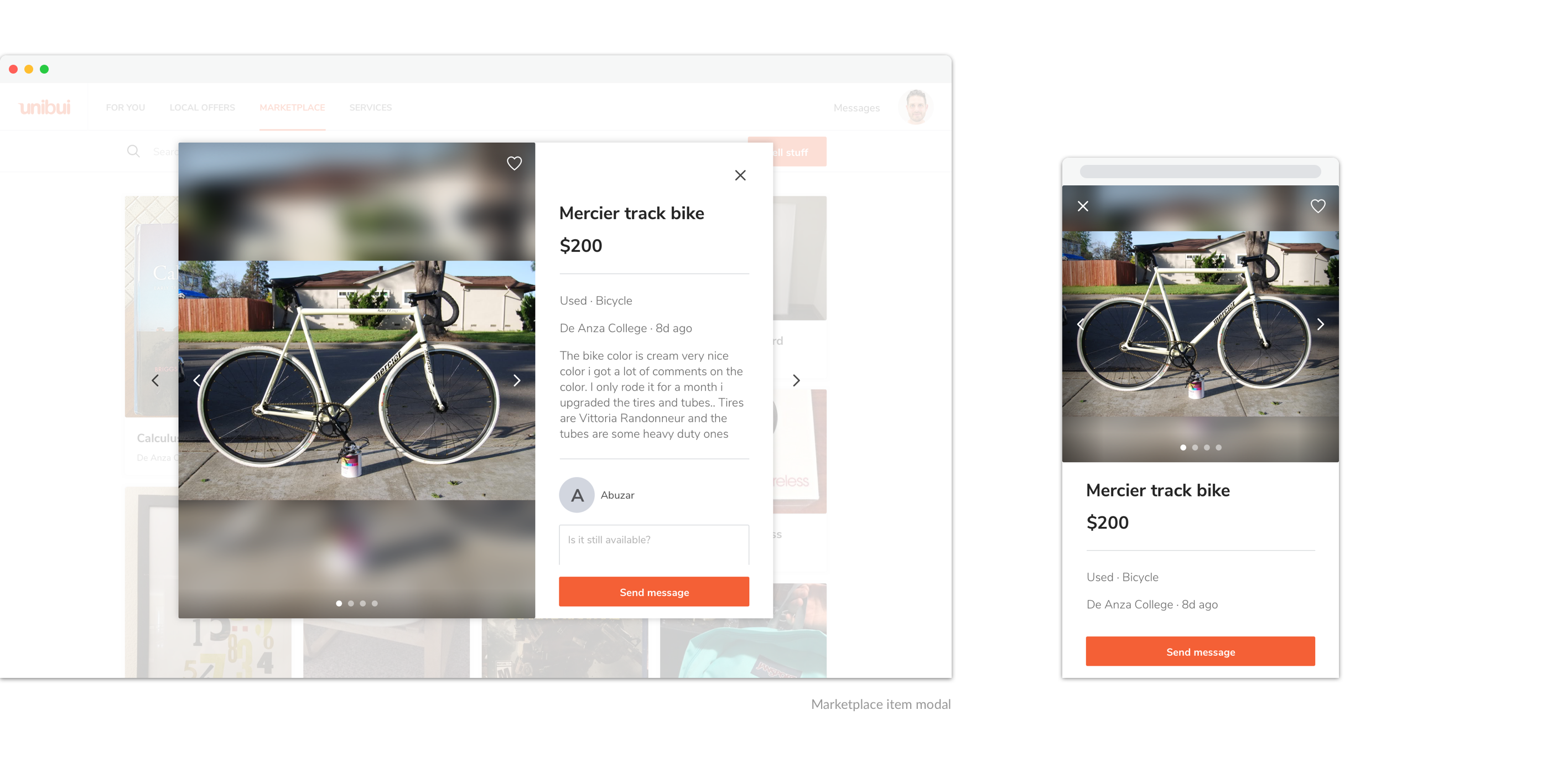
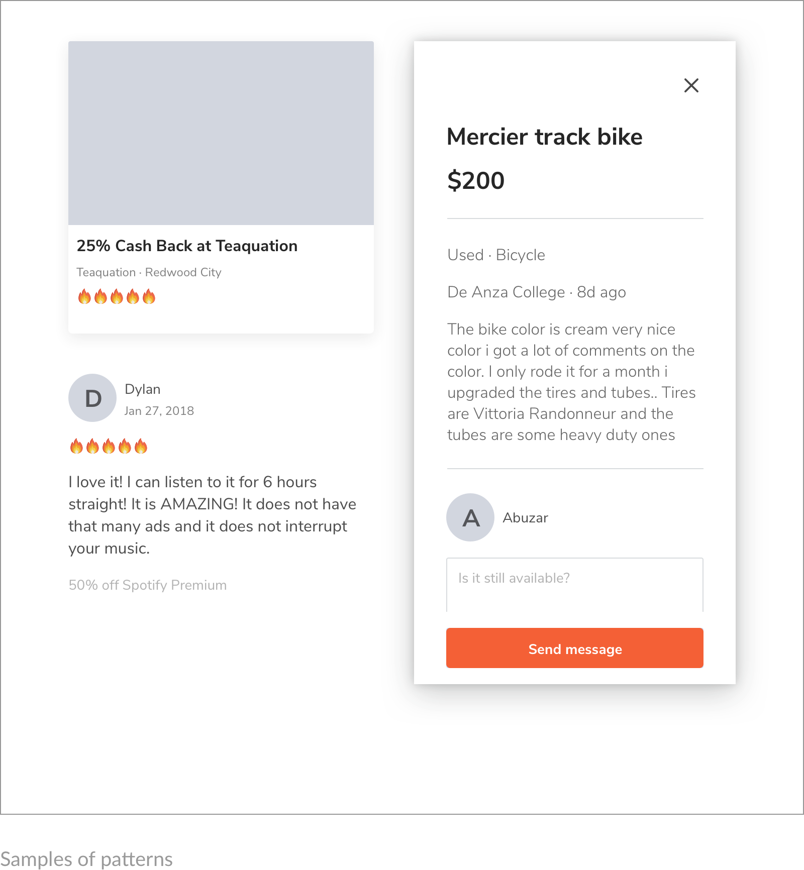
In contrast, we wanted our users to be able to quickly browse the marketplace. So a modal is used for each item posted on marketplace. Users can check the detail of an item and send a message to the seller without leaving the marketplace list, and switch between items easily.
Messages, Notifications and ... More
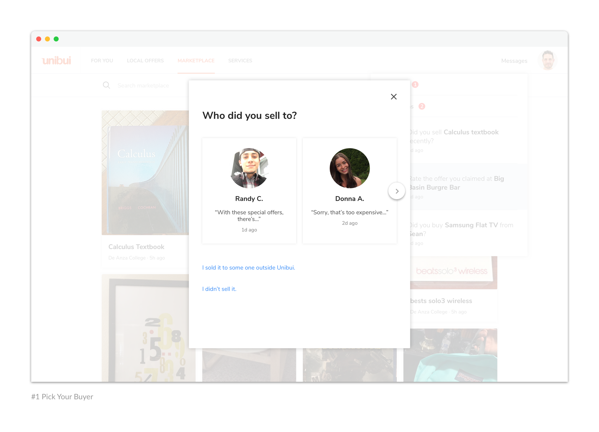
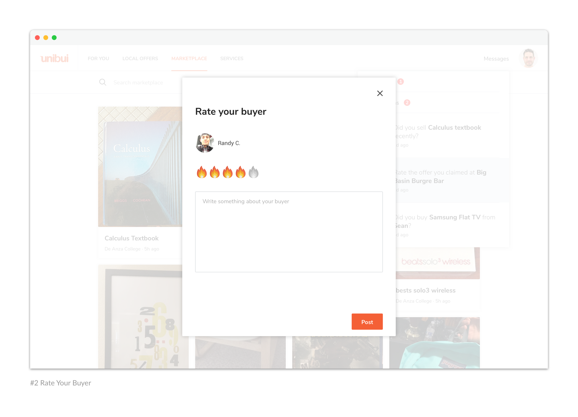
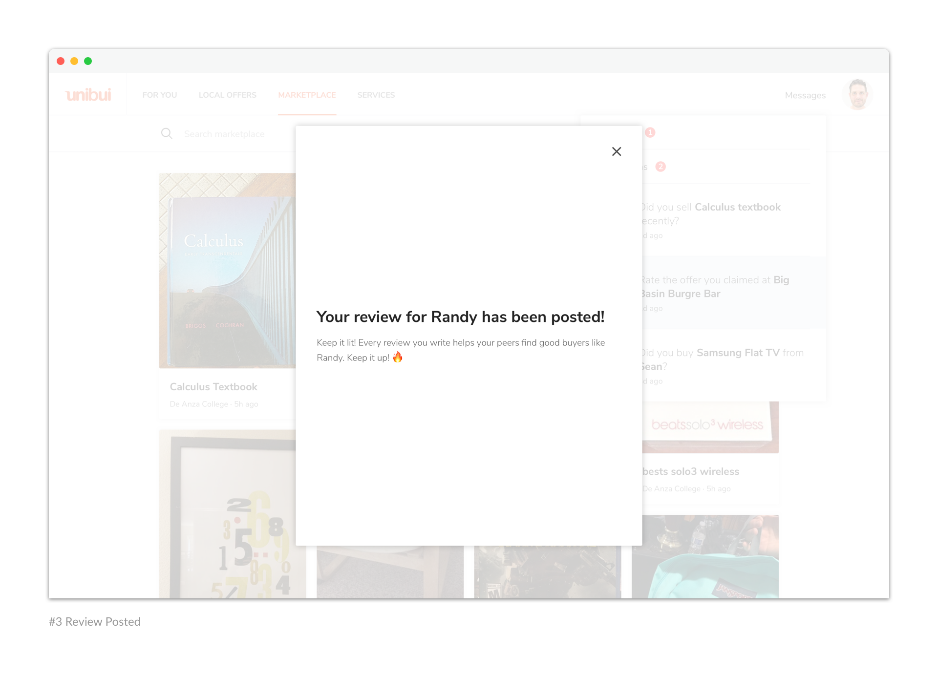
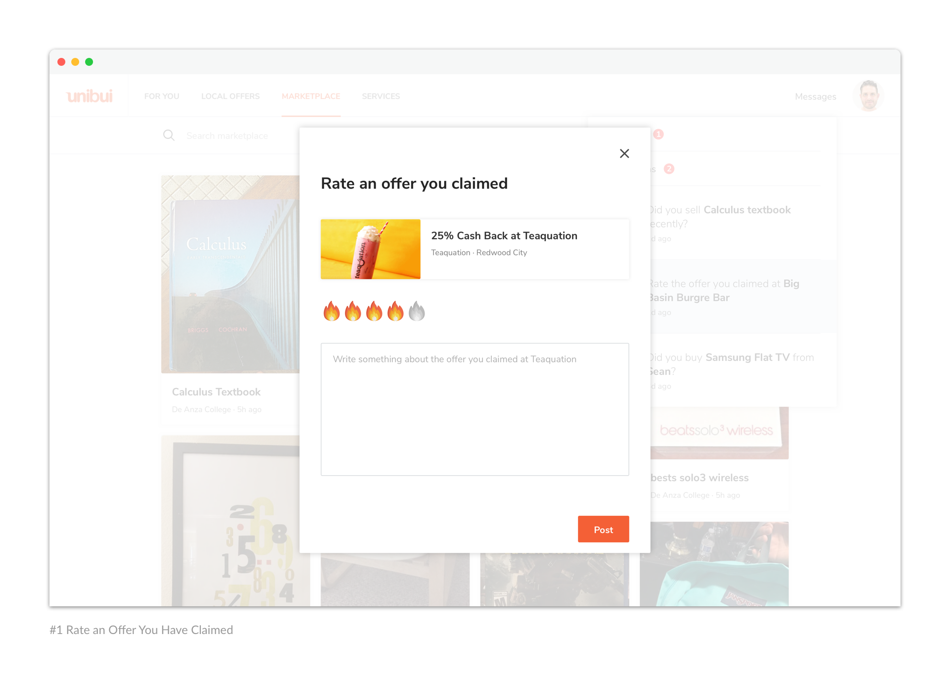
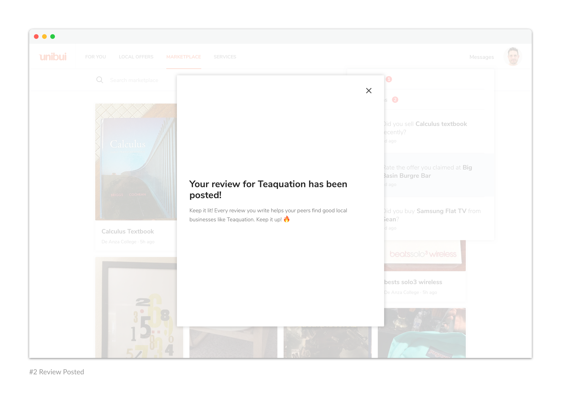
Another challenge we met was the Messages and Notifications features. They play an important role in the whole user journey of Unibui: sellers and potential buyers use our messages feature to communicate with each other; users receive notifications to rate their transaction partners and review the businesses where they claimed discount offers, in order to help their peers find great deals.
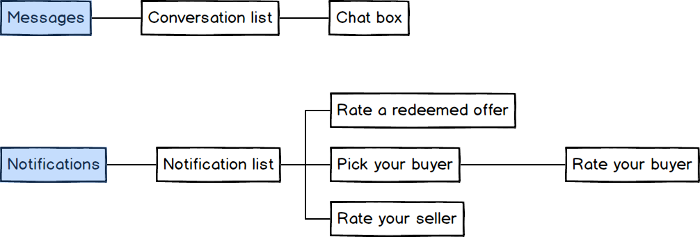
We had many options for how to layout the features— we knew we wanted them to be intuitive and accessible, but that it needed to be information-dense in a relatively limited space. The interesting thing here was to present a lot of information in an accessible way—the conversation list, chat box, notification list—while maintaining simplicity as one of my longtime design principles.
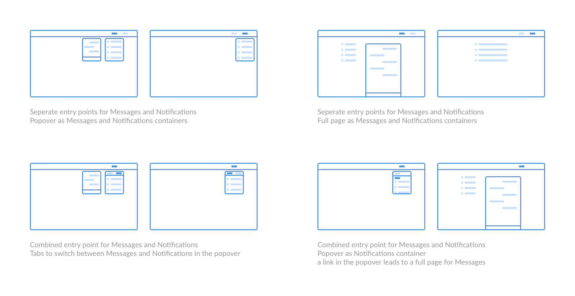
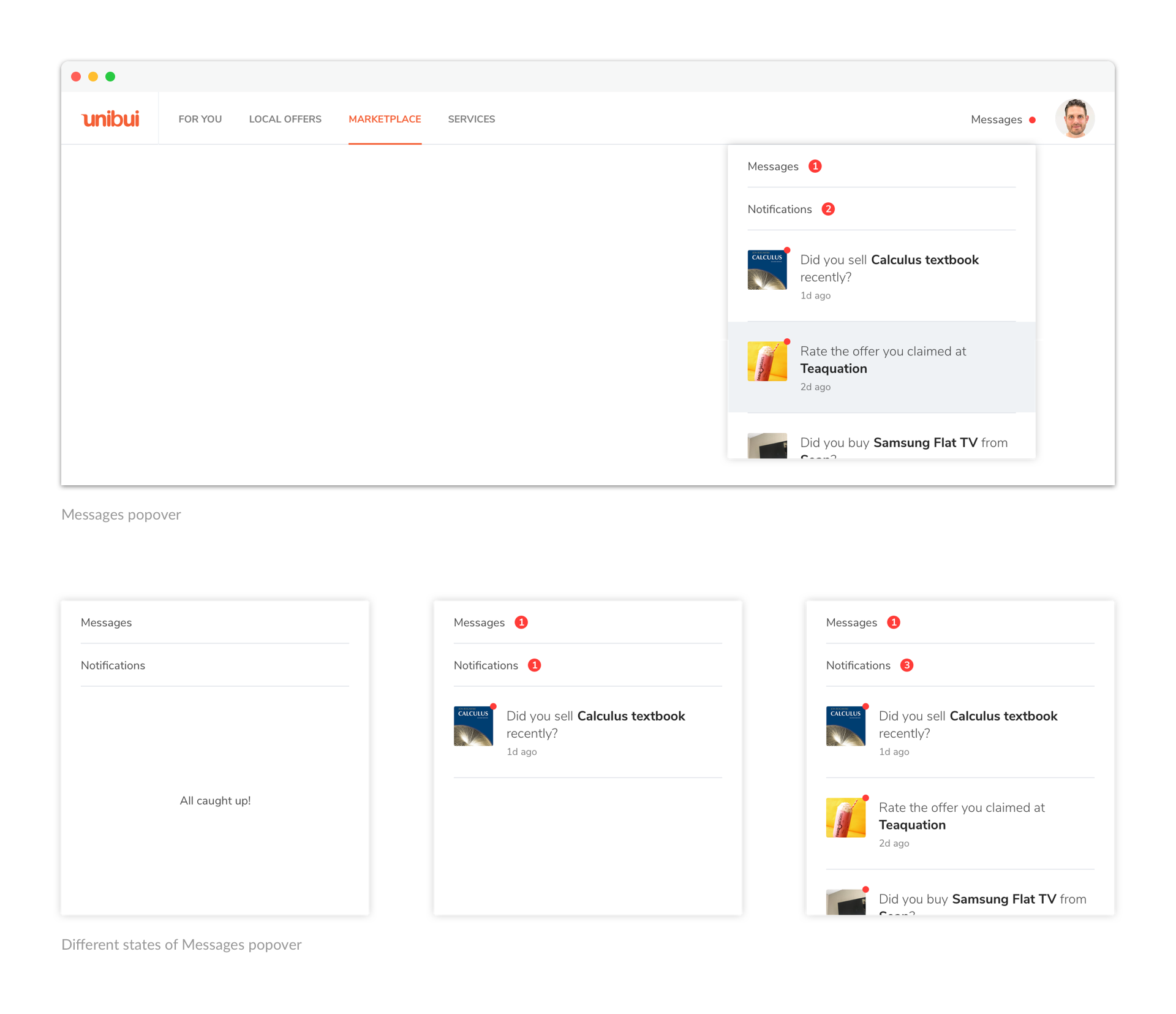
Some websites have separated entry points for notifications and messages on their home pages. In contrast, we saw the similarities of the two - notifications can be seen as messages sent to users by the site itself. So we combined the entry points into one Messages link. It also helped save the limited space of the primary nav bar. The messages popover shows all unread system notifications directly and contains a link to messages page (with a badge showing numbers of unread messages from other users).
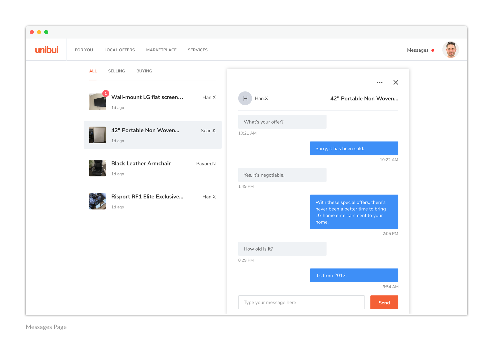
On messages page we organized the conversations based on both the user you are talking with and the item you are talking about, considering the user needs of dividing the conversations about different items even when they’re from the same seller. We also added a tab bar to the conversation list to help user filter the conversations by categories like 'Buying' and 'Selling'.
The messages popover serves as an important entry point of a few actions and flows, including mutual review of buyers and sellers, and the rating and review of businesses and offers.
We tried to made the processes intuitive and seamless. For example, the system would send a notification to a seller when it detected he had a few conversations with other users about a certain item he was selling, asking if he had sold the item to any of them. We would show name cards of the potential buyers in the modal. Those cards contain their names, avatars, and the last message they sent, to help our users recognize the right person and provide accurate feedback.
Make It Responsive
As a big part of users are accessing Unibui on mobile devices, it is very important to optimize the design for various screen sizes. Since the beginning, we have kept this in mind and fulfilled responsive design throught every step of our process.
Establish Conventions
Alongside designing the pages, we established some conventions and patterns on how contents should be laid out (eg. the grid layout can also be used for "Favorites" and "Claim history"). Conventions were established for interface copy (eg. “Capitalize first word in buttons”, and “Capitalize first word for titles”.) and naming.
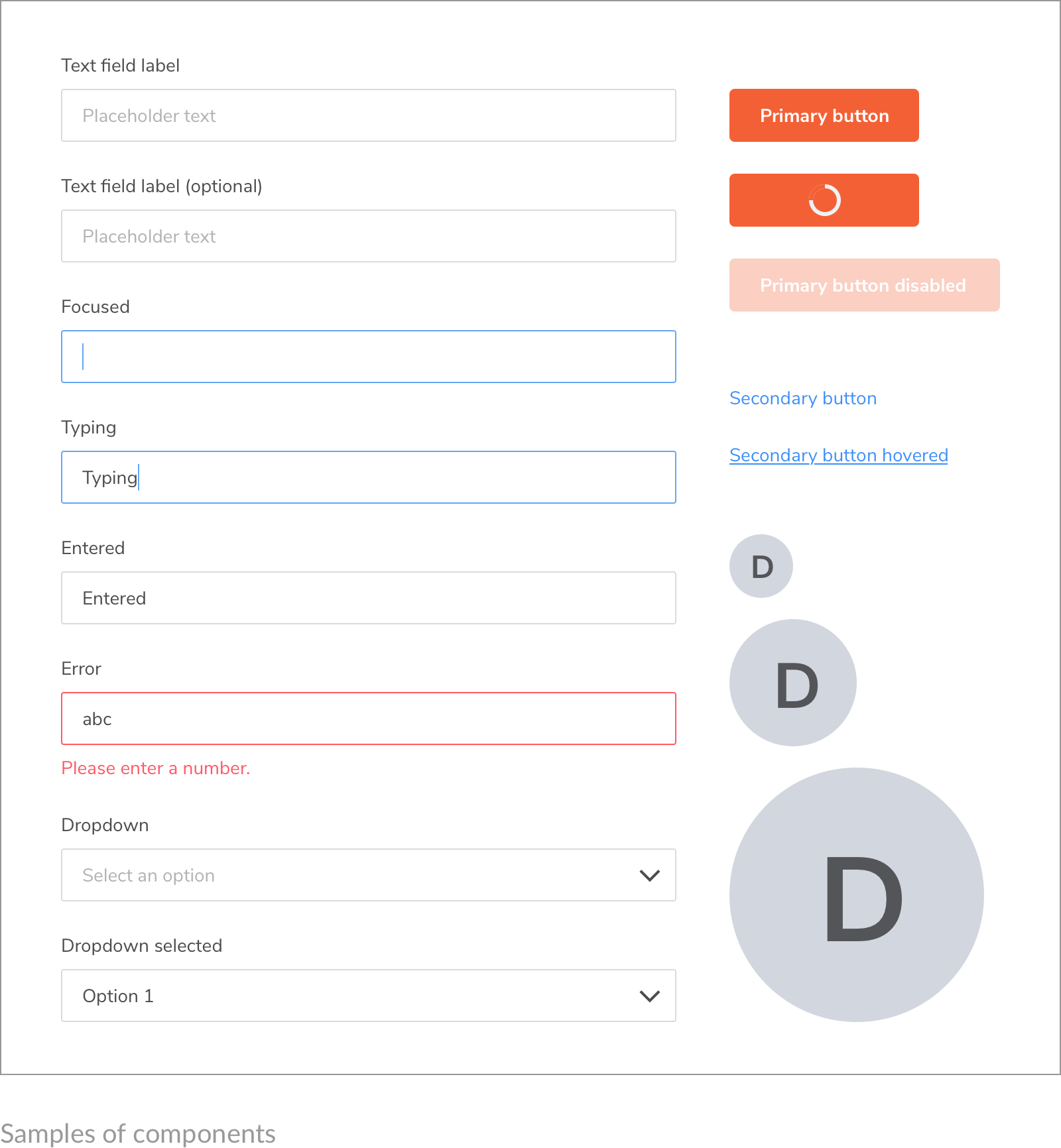
We also set conventions for components such as buttons (primary button, secondary button, and tertiary button) and forms (normal state, focus state, typing state, error state, and helper text).
To further reinforce consistency and enhance efficiency in design, we compiled atomic components into patterns and documented them in a library. We defined how different components should be put together to become patterns and achieve certain functions in a reusable way throughout the platform.
To share our style guides within our team we recently started to use GitBook — an easy way to write and maintain documentations. The document has a way to go before becoming a completed design system. But we are always keeping on refining.
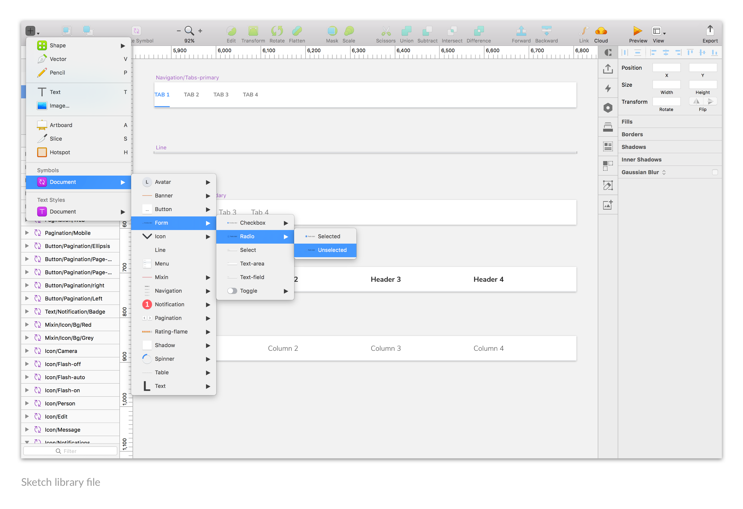
I made a sketch library file and turned all UI components into symbols. The library file greatly improved my efficiency and would help a lot onboard future team members.
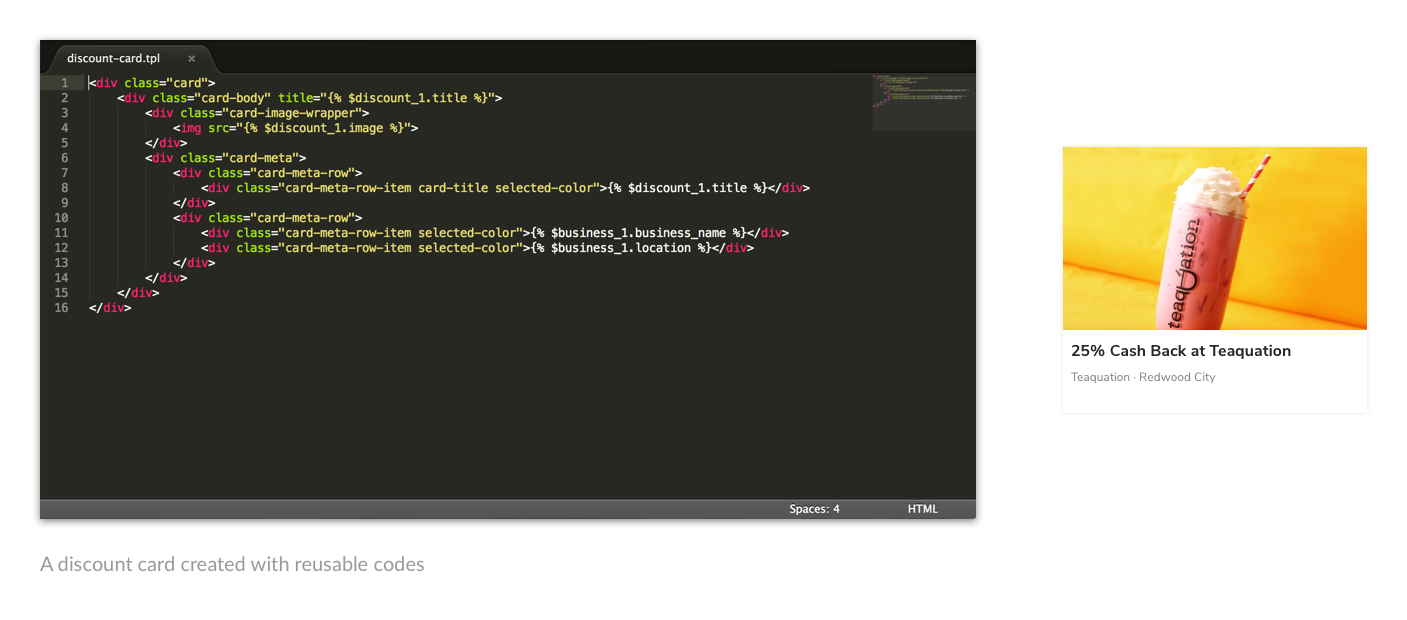
We also wrote some small blocks of code of the reusable components. The bonus included improving communication between designer and engineers, enhancing productivity, and keeping our codes clean.
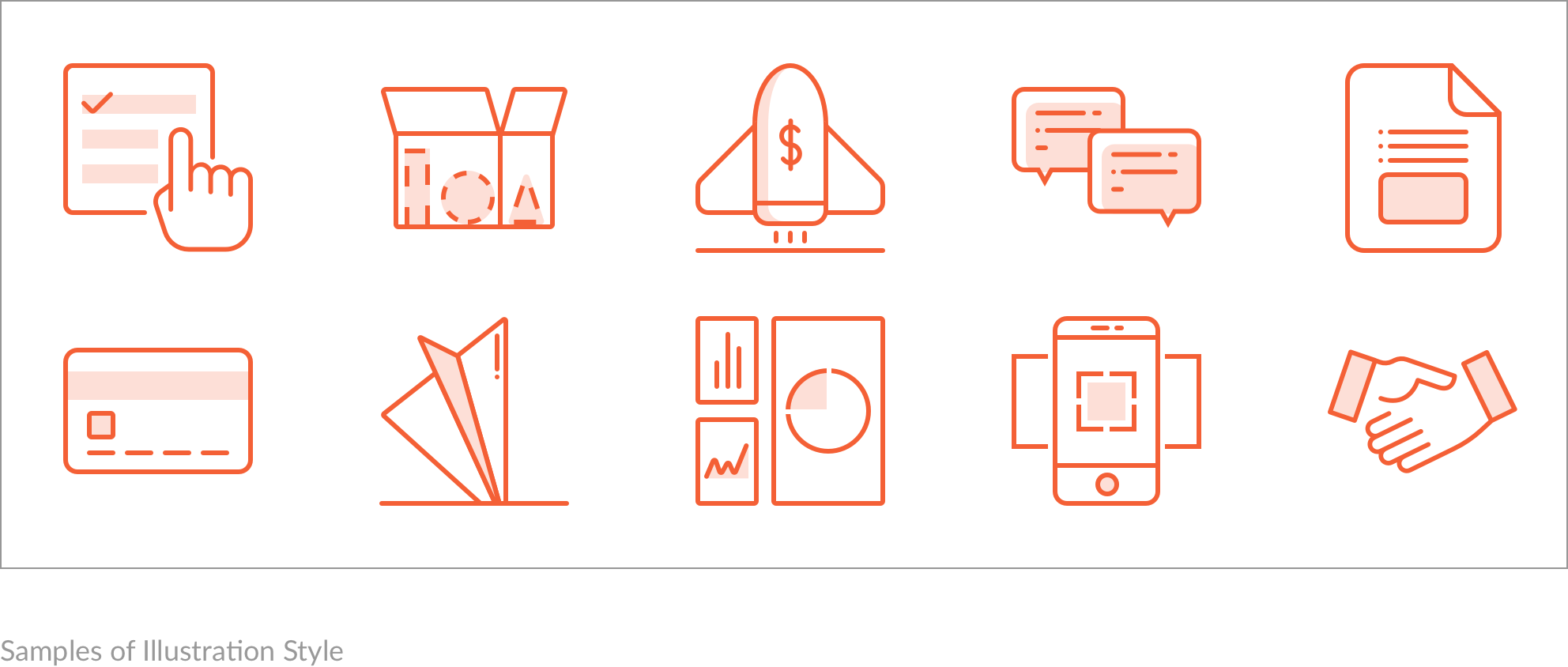
I created a dozen custom illustrations for empty states of different cases. I also extracted the guidelines behind the illustation style so I can product new illustations easily. These illustrations are of an outline-based, monochromatic style, and can be drew out easily with vertical, horizontal, or diagonal lines and transparent shades.
Results
Starting from scratch, the site has received positive feedbacks from users since it was launched in early 2018. Metrics like website traffic, number of users and average time on site are increasing greatly as we put more resource into marketing and growth. Most features work well. Most users behave in the way we designed and feel it's natural and intuitive.
As the designer, I'm happy to see some of my design decisions get validated. I also learned a lot during this process. I further find some way to cooperate with a team, in mind and in real life. I learned to communicate with other roles in the team, deliver understandable specs, keep version control of our assets, and finally work out a streamline working flow for the team.
Selected Works

LENOVO MOBILE APPProject type
UNIBUI MOBILE APPProject type

UNIBUI ANALYTICSProject type

UNIBUI BUSINESSProject type

UNIBUIProject type

COLGATE INNOVATION PORTALProject type