UNIBUI MOBILE APP
DELIVERABLES
UX strategy
User flows
Wireframes
User Experience
User Interface
ROLE
UX lead
Unibui is a platform built to benefit college students, offering them exclusive online/offline discounts and promos. It also provides a marketplace for students to buy from and sell to their peers on campus. Since its launch in 2018, It has been adopted by local colleges and businesses around the bay area and is fastly expanding nationwide.
We came out with a web version of Unibui at our first launch. By the same time, we are working on a mobile app which includes all our student-facing features to allow students enjoy Unibui service everywhere. I was responsible for the design of the app and worked closely with the engineering team throughout the development process.
Reorganize the Features
Our aim was to make all features on our student web site available on one mobile app. But transplanting was not easy because mobile and desktop are very different environments and users tend to have different habits while using desktop and mobile apps (even when they are from the same provider and have the same services).
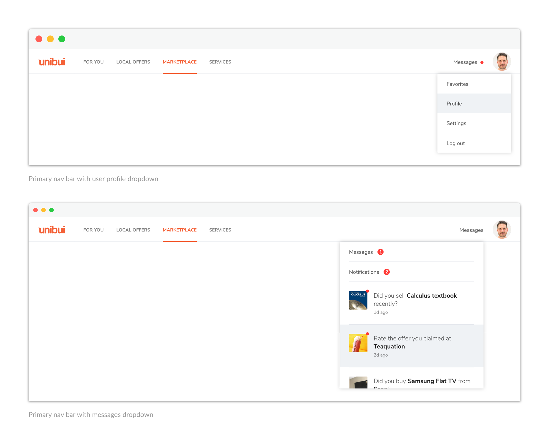
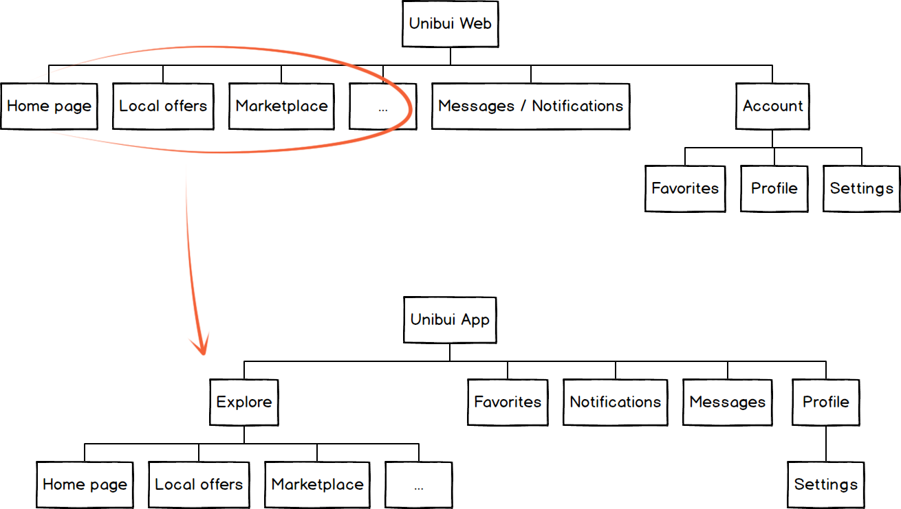
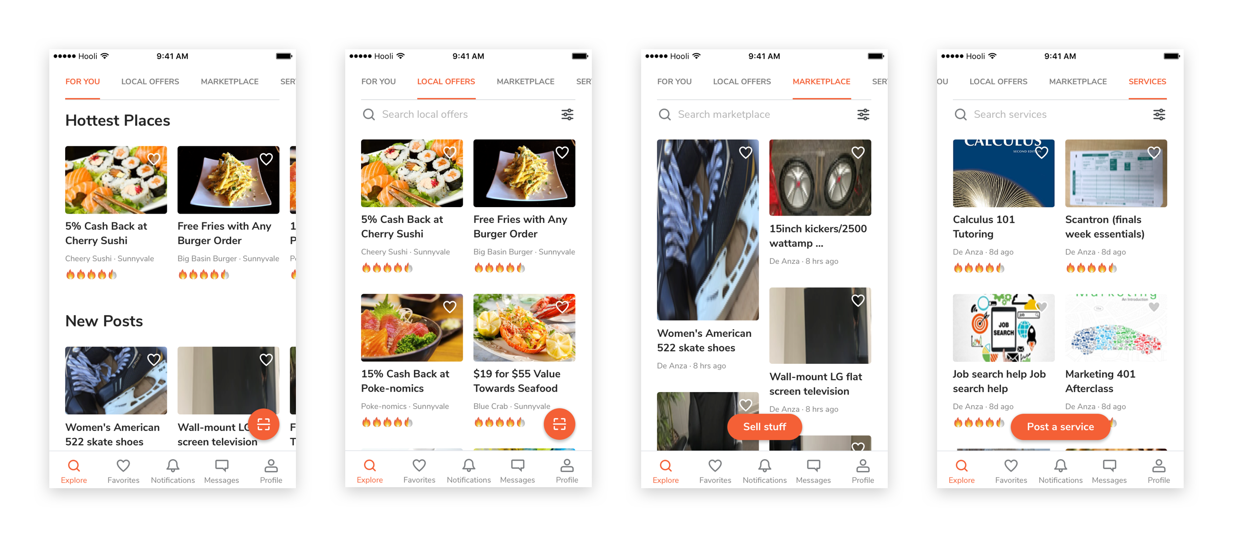
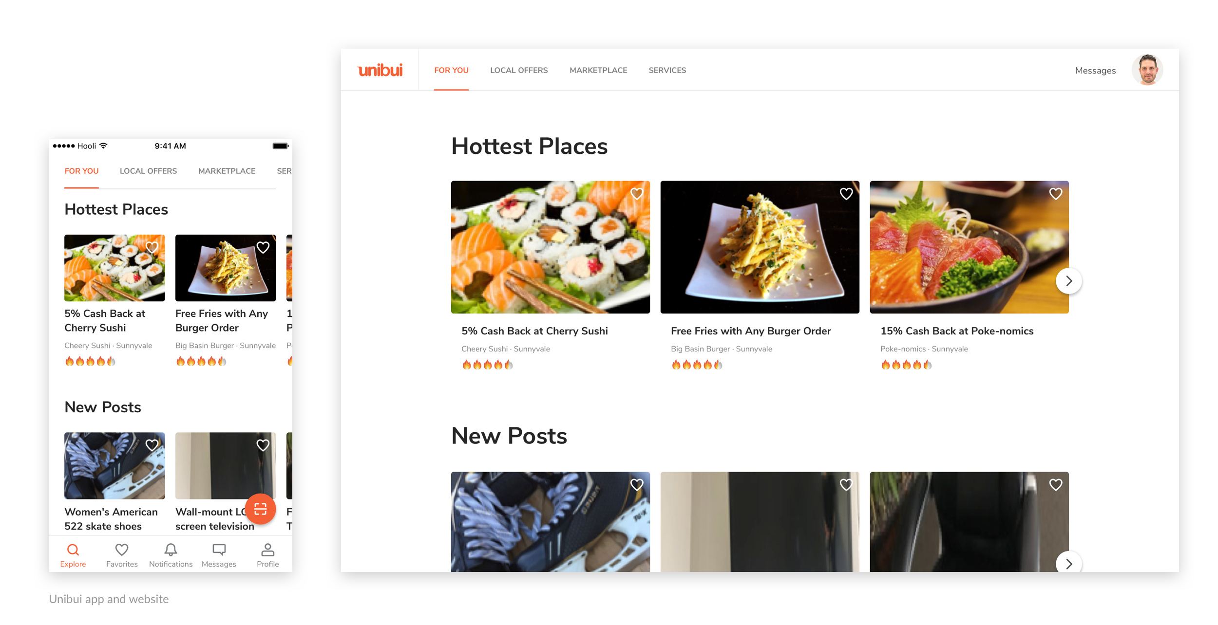
First, we need to change the way we organize our features to fit mobile user habits and scenes. Take a look at how our features are organized on desktop. All content-related sections are aligned from the left side of the nav bar, while user functions (messages, notifications, favorites, profile, settings) are gathered on the right side and under the dropdowns.
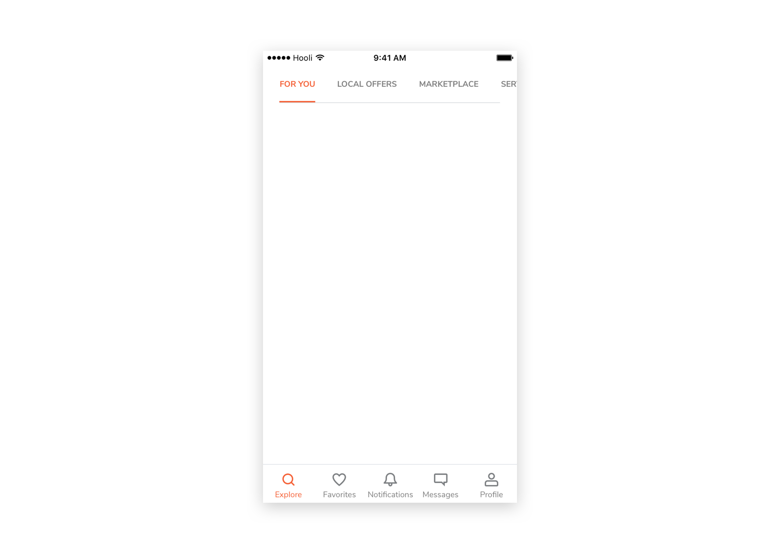
We chose to use a bottom tab bar as the top layer organzier of the app. We arranged all user functions on this level and integrated all content-related sections to the "Explore" tab. Then we have a seperate tab for contents that user had saved or "Favorited" and a tab for user profile and settings, as well as their discount offer claim history. Also, messages and notifications get their own tabs.
As a result, the info architecture of the app is slightly different from the website.
Browse Contents Easily
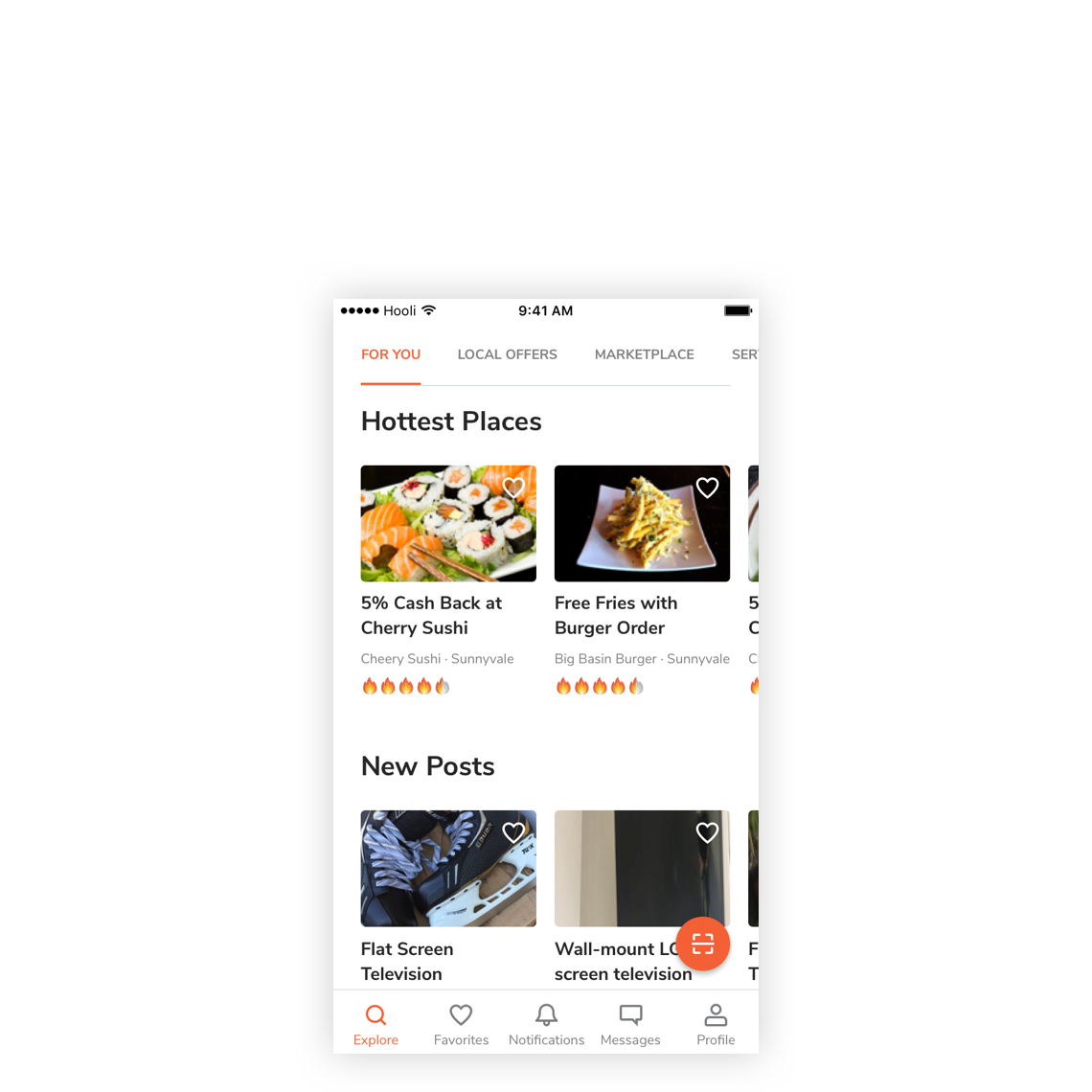
All content-related sections are now integrated into the "Explore" tab. So it is necessary to find a way to further classify the contents for users to easily browse and switch between them.
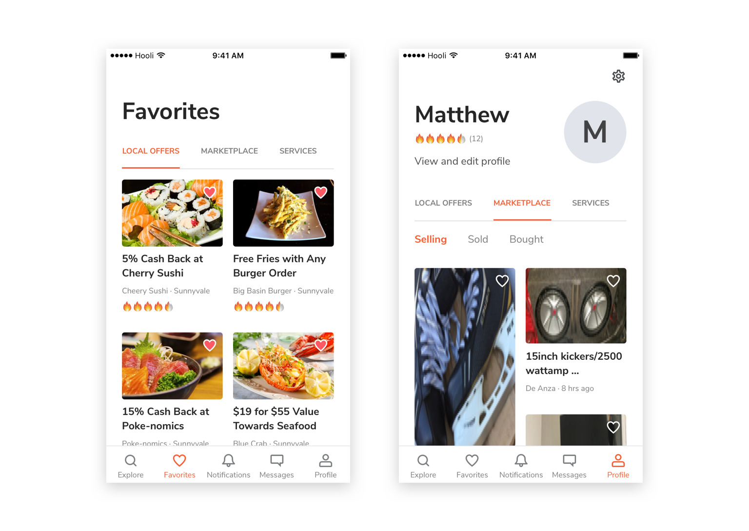
We used a top tab bar to achieve it. Mimicking the nav bar on our web, the tab bar gives users a familiar feeling and they will know how to browse the app at the first time. The tab bar can also be used to classify contents in other views of the app , like "Favorites" and user discount offer claim history.
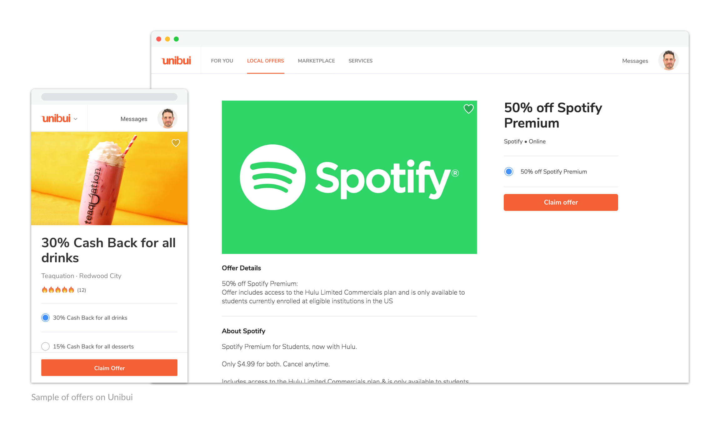
An Intuitive Offer Redeeming Flow
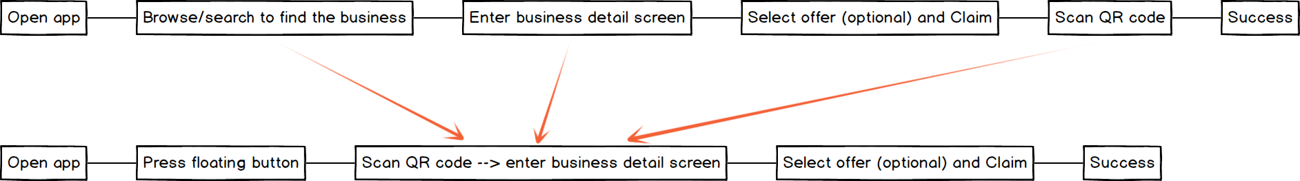
On our web version, when a user want to claim/redeem a discount offer, he needs to go the specific business page from the offer list page first, and then select and claim an offer there by entering a business code.
However, this flow doesn't fit our mobile user scene. Most our mobile users would already be physically inside a local shop when they want to redeem an offer of the shop. It's a chore to ask them to find this shop from a long list of businesses before they can redeem an offer.
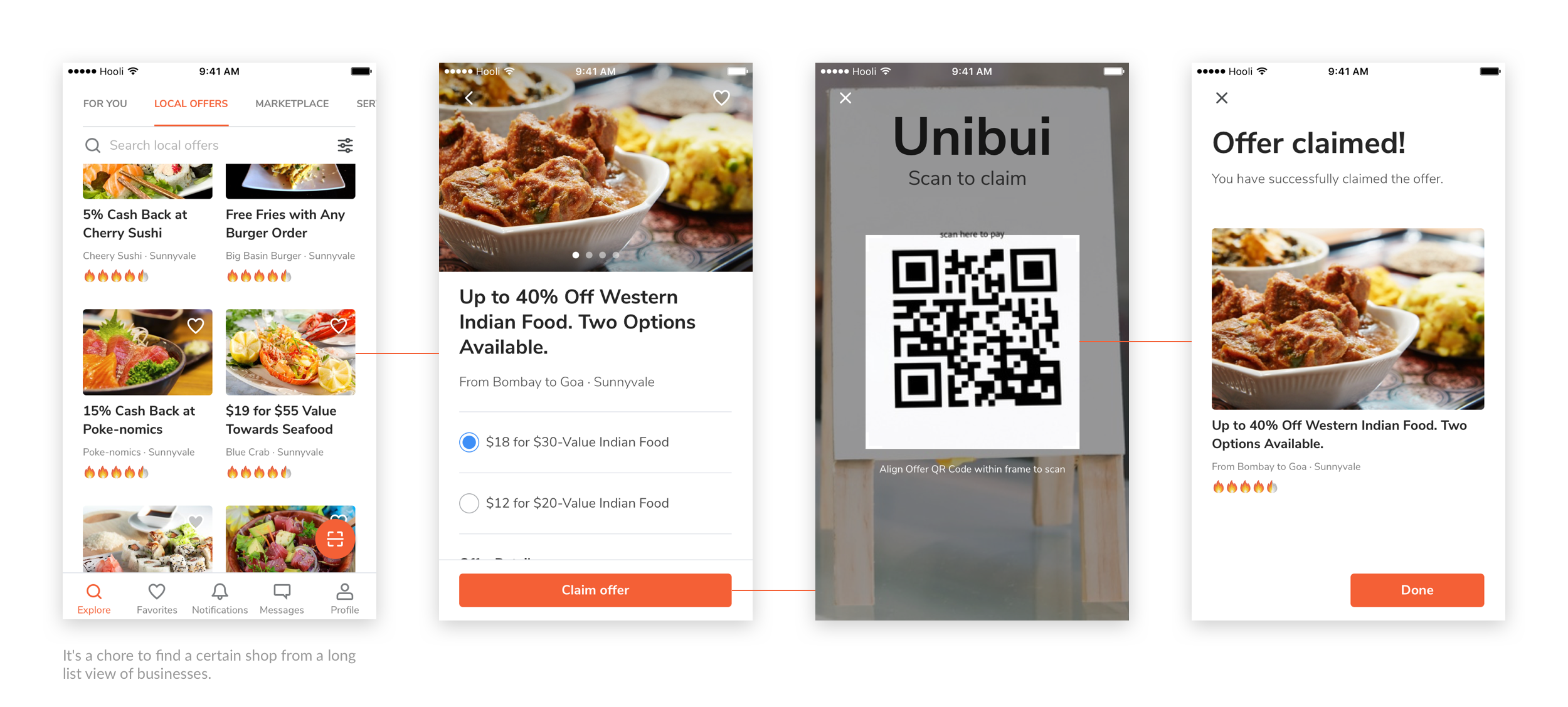
We came up with a shortcut for our users. We set a floating button which will always show up under "Explore" tab (default view of the app). So users can scan the QR code at the shop counter and quickly go to the page of this shop and claim the offer with an easy press. Users don't need to scan QR code or enter business code again because they already scanned it.
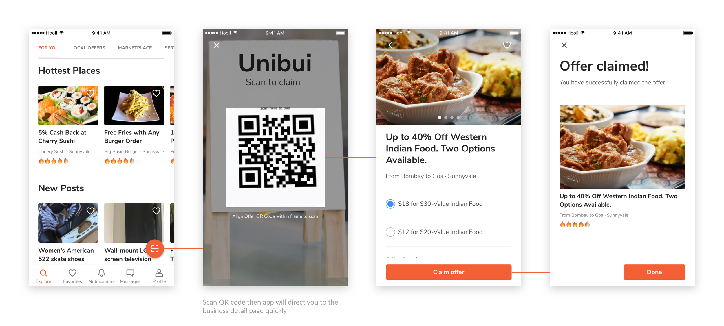
We managed to simplify the user flow of redeeming an offer by allowing the switch of two steps in the redeeming process. By creating the feature of "Scanning QR code to go to certain business detail page", we let the app do the time-consuming searching work for our user to provide a more fluent user flow.
Notifications & Messages
We managed to simplify the user flow of redeeming an offer by allowing the switch of two steps in the redeeming process. By creating the feature of "Scanning QR code to go to certain business detail page", we let the app do the time-consuming searching work for our user to provide a more fluent user flow.
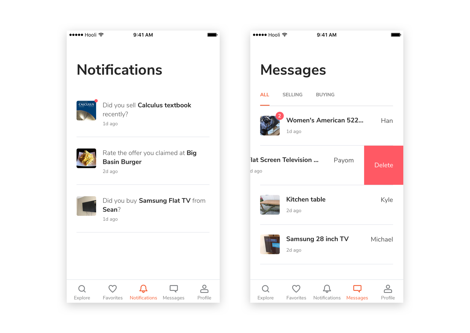
Favorites and Profile
We set the "Favorites" tab for contents that user had saved for users' easy access in the future. In contrast, users' offer claim history and marketplace history are combined with user profile and settings.
Keep Consistency
Keeping a systematic mindset, we used a lot of shared visual styles and UI components on the Unibui mobile app and web in order to provide our user with a consistent experience. Besides it, we built most our features with React so we can reuse some of the code blocks from the web version and transplant the iOS app to Android within a shorter time period. This also greatly improved our working efficiency.
Selected Works

LENOVO MOBILE APPProject type
UNIBUI MOBILE APPProject type

UNIBUI ANALYTICSProject type

UNIBUI BUSINESSProject type

UNIBUIProject type

COLGATE INNOVATION PORTALProject type