UNIBUI BUSINESS
DELIVERABLES
UX strategy
User flows
Wireframes
User Experience
User Interface
ROLE
UX lead
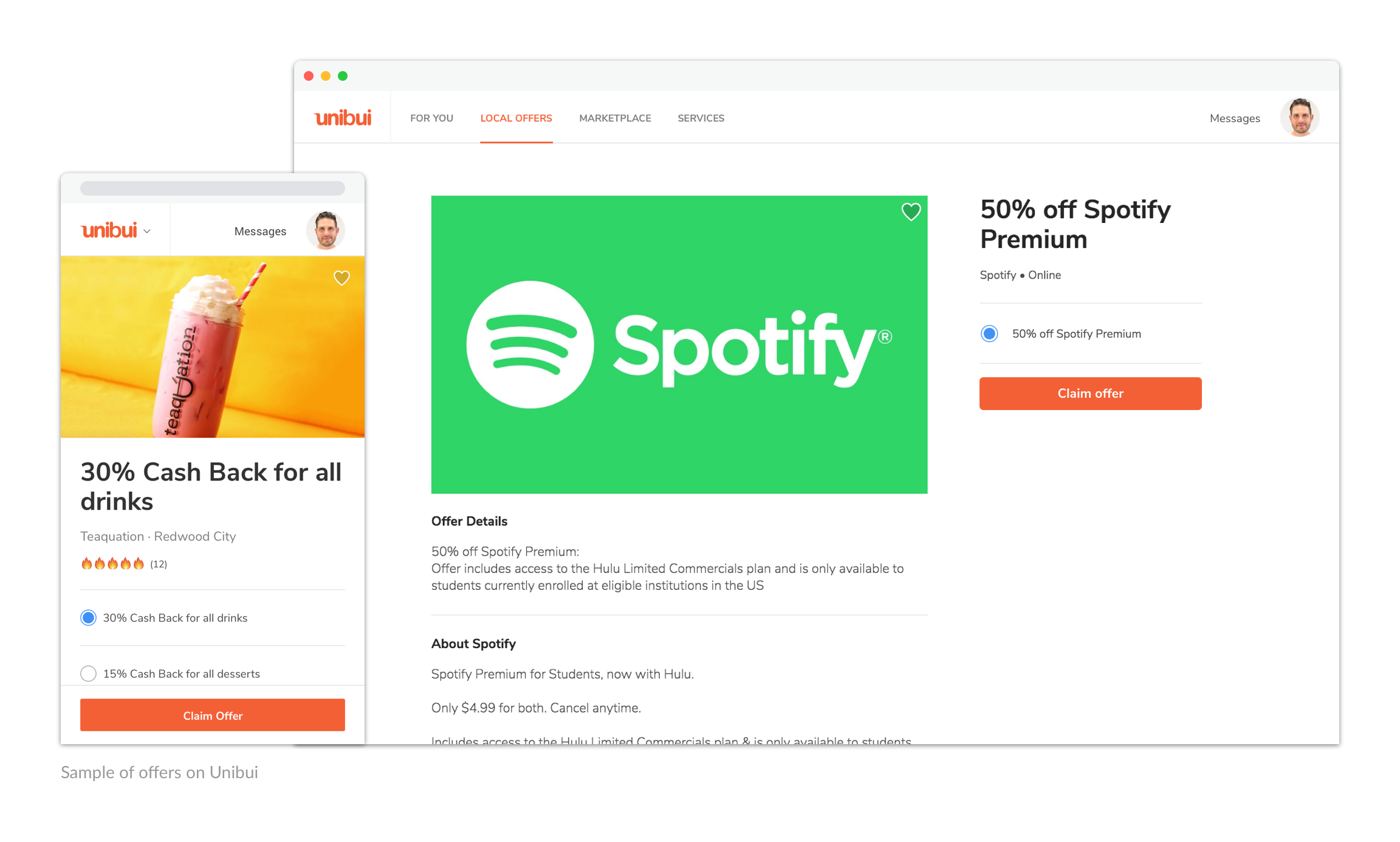
Unibui is a marketplace where businesses can post promos/discounts to promote themselves to college students. I have discussed Unibui's student portal in my last post. Beside the student platform, we also provide a business management tool to our business users to manage their promotions and get insights from the metrics.
In this post, I'll discuss how we architected the Unibui Business platform.
How to Architect the Site?
When we started to thinking about how we gonna architect the business site, we found that the two basic elements of the service we provide are “offers” and “locations”. Different ways of arranging those two elements constitute Unibui Business platform. For example, "A student claimed Discount Offer 1 (one of four offers) at Location 2 (one of three physical store locations) at some point of time" is a typical event in the eyes of a business owner on Unibui.
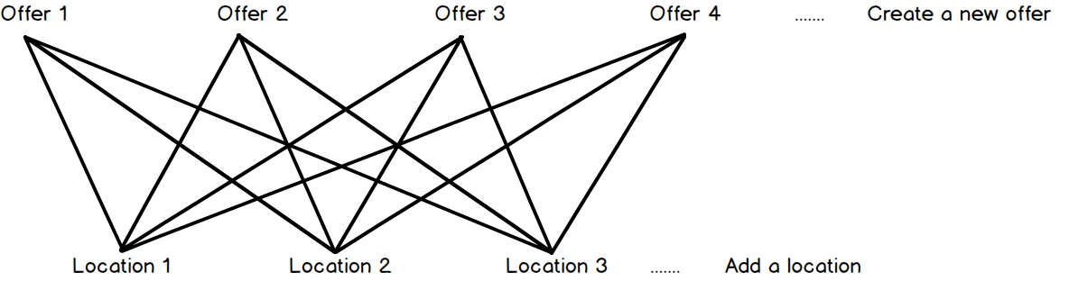
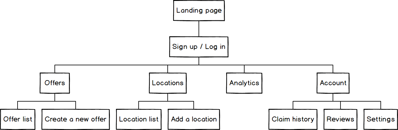
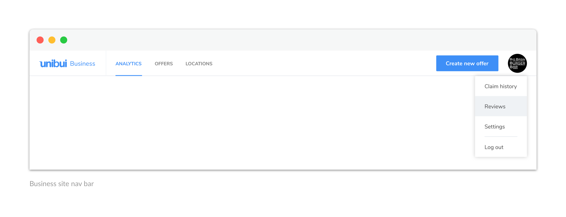
So we decided to make the sections about offers and locations as the backbone of our site, along with the analytics section, and everything about the business account (e.g.. claim history, customer reviews, settings and payments).
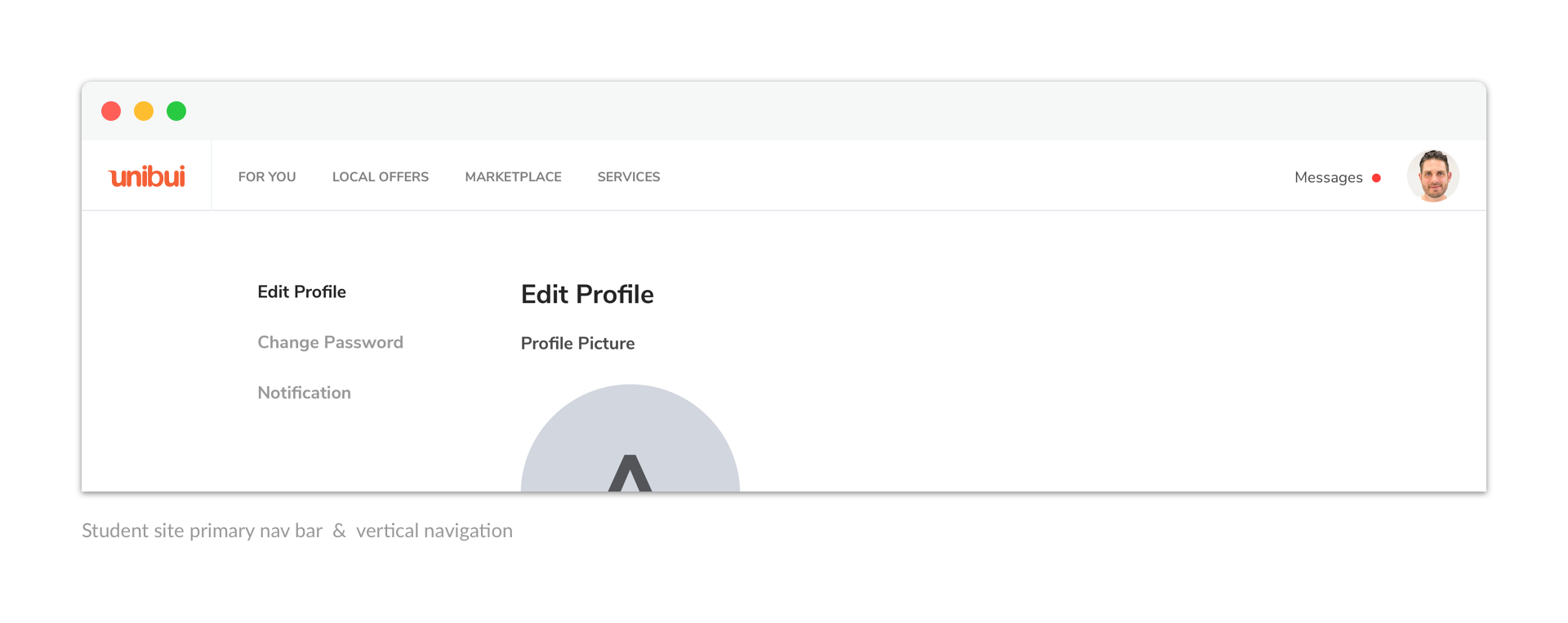
Having a horizontal primary nav bar and a vertical navigation currently in use in our student site, we decided to reuse the nav bar to navigate between those features (use the vertical menu as a secondary navigation if necessary) in order to keep consistency among all Unibui services..
Although logically with the same importance in the structure, we thought “Create a new offer” is a much more encouraged and frequently-used action than “Add a location”, so we set it as the one primary button in the nav bar.
We also decided to use Unibui blue color as the theme color of Unibui Business platform to fit its nature as a business management tool and distinguish it from our student platform. Our final version looked like this:
Offers & Locations
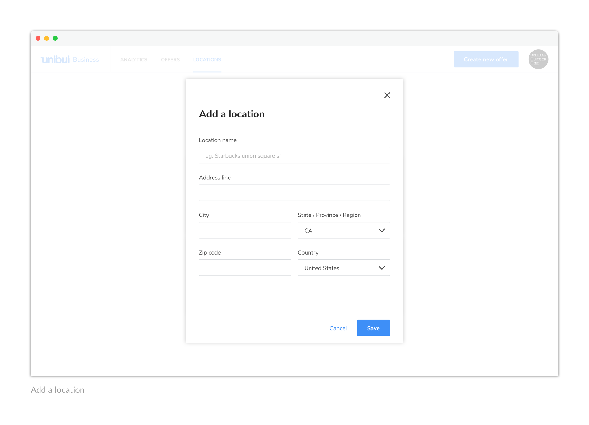
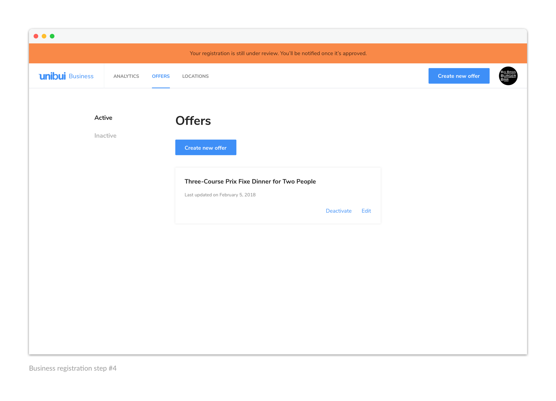
The structures of those two sections are pretty similar, so I’ll put and introduce them together: a list of offers/locations sorted by the time added and an “Add new item” button on top of each list. The only difference is the respective item cards: a location card contains a mini map and its Location Code/QR Code generated by the system, while an offer card only shows the title of the offer. Business users can easily check the promos/discounts they are currently offering and the locations where those offers are available.
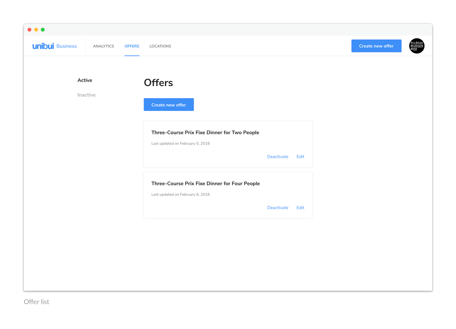
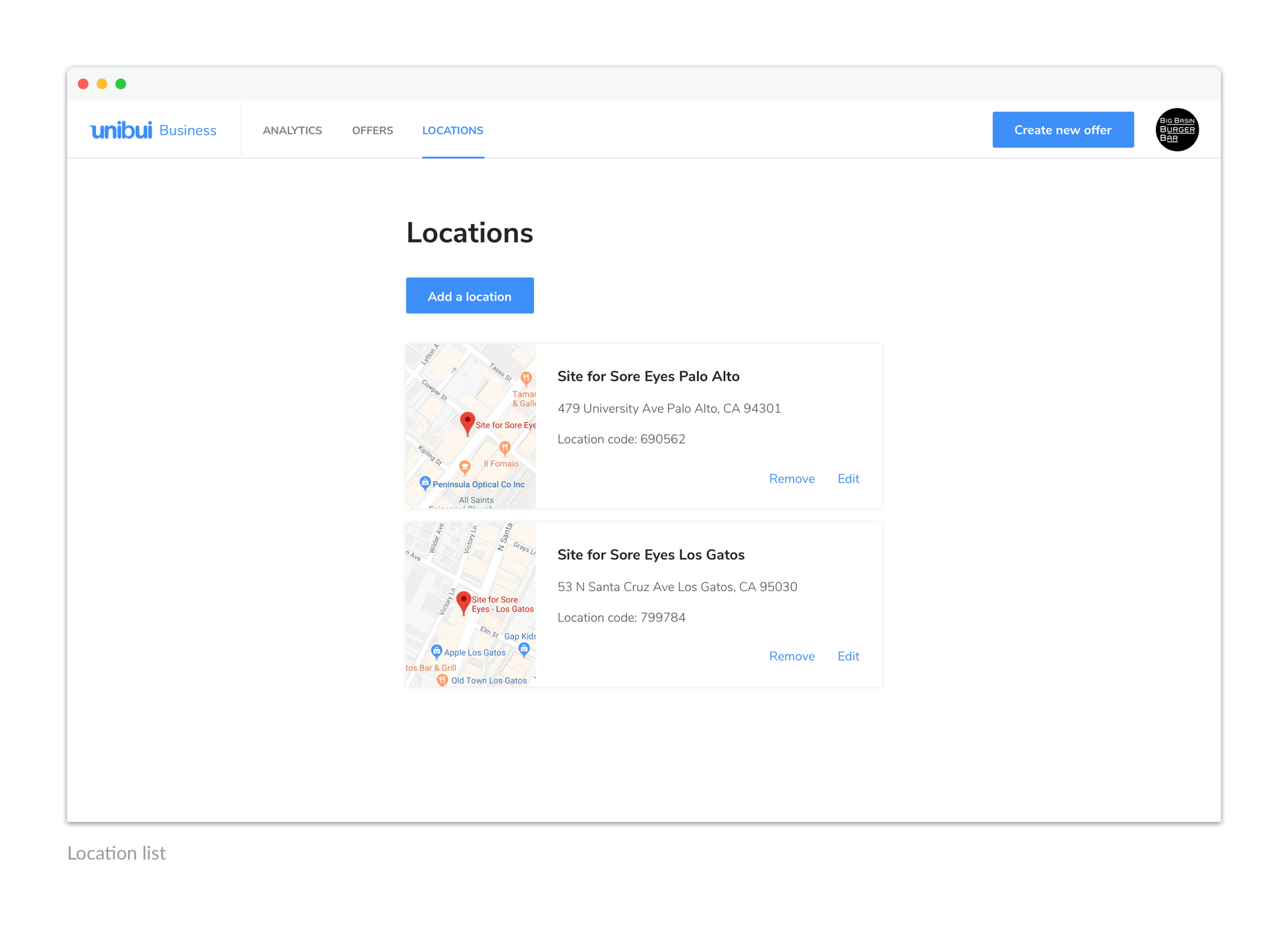
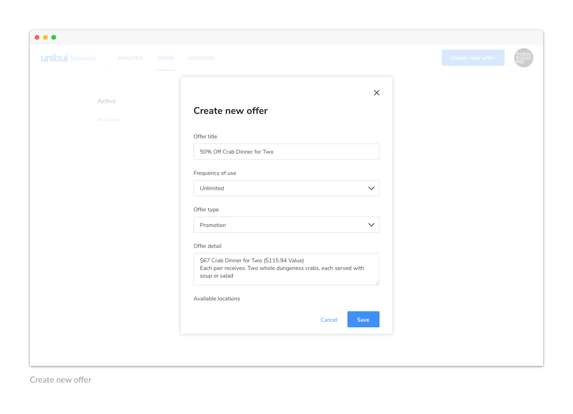
The "Add new item" flows are also similar. Just click the button and fill in the forms. Users can set an offer to be available only at a few selected locations when creating a new offer.
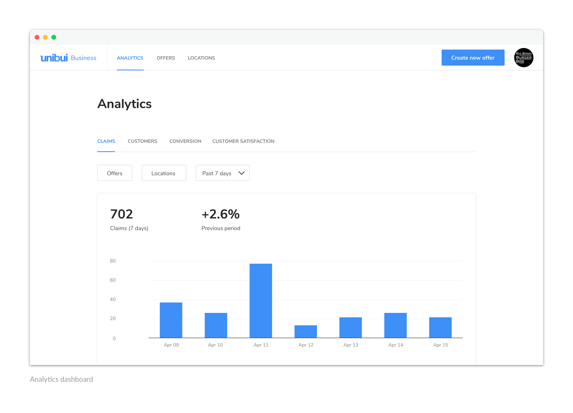
Analytics
The Analytics dashboard is a relatively independent section of the site. We set it as the default view of the site to give our business users a quick glimpse of their business performance.
We provide our business users with unique perspectives and helpful insights we get from the raw data. These metrics are sorted into four categories based on the perspective to which they are related. We also worked out a few guidelines behind the charts and colors we used to visualize the data.
I'll discuss our path to the final Analytics dashboard as well as the principles and guidelines we set for data visualization in another post.
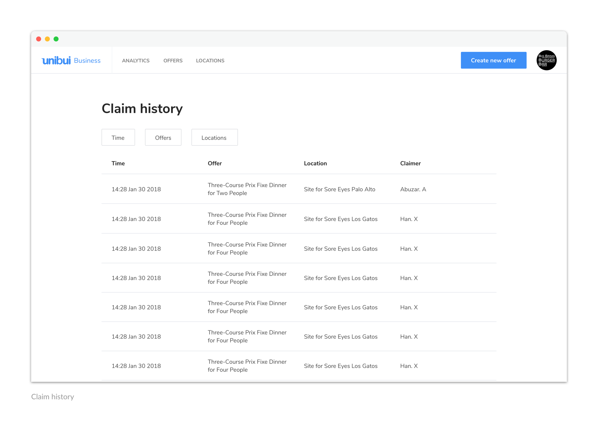
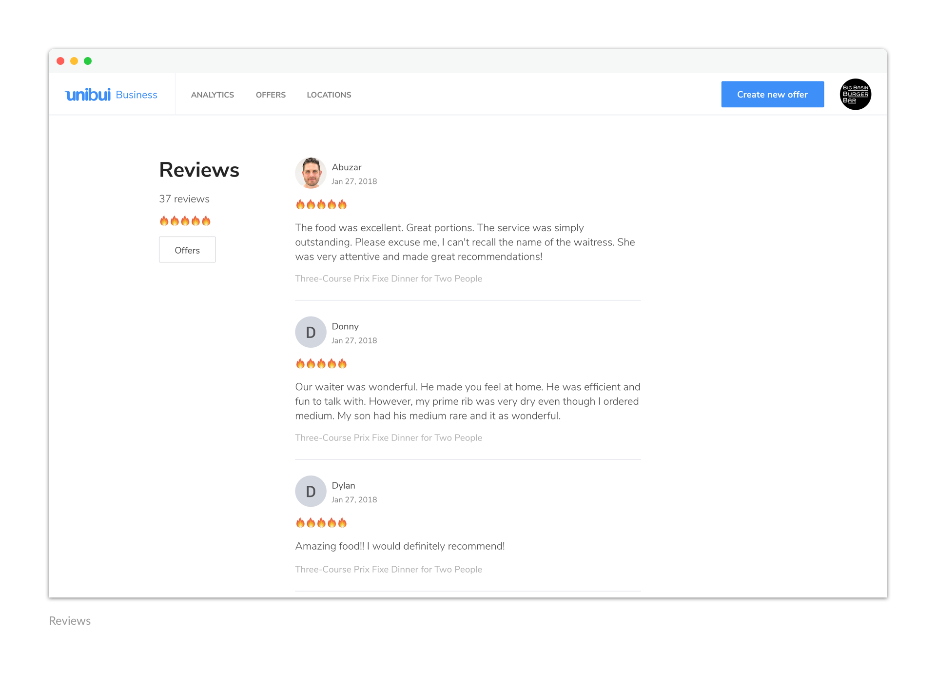
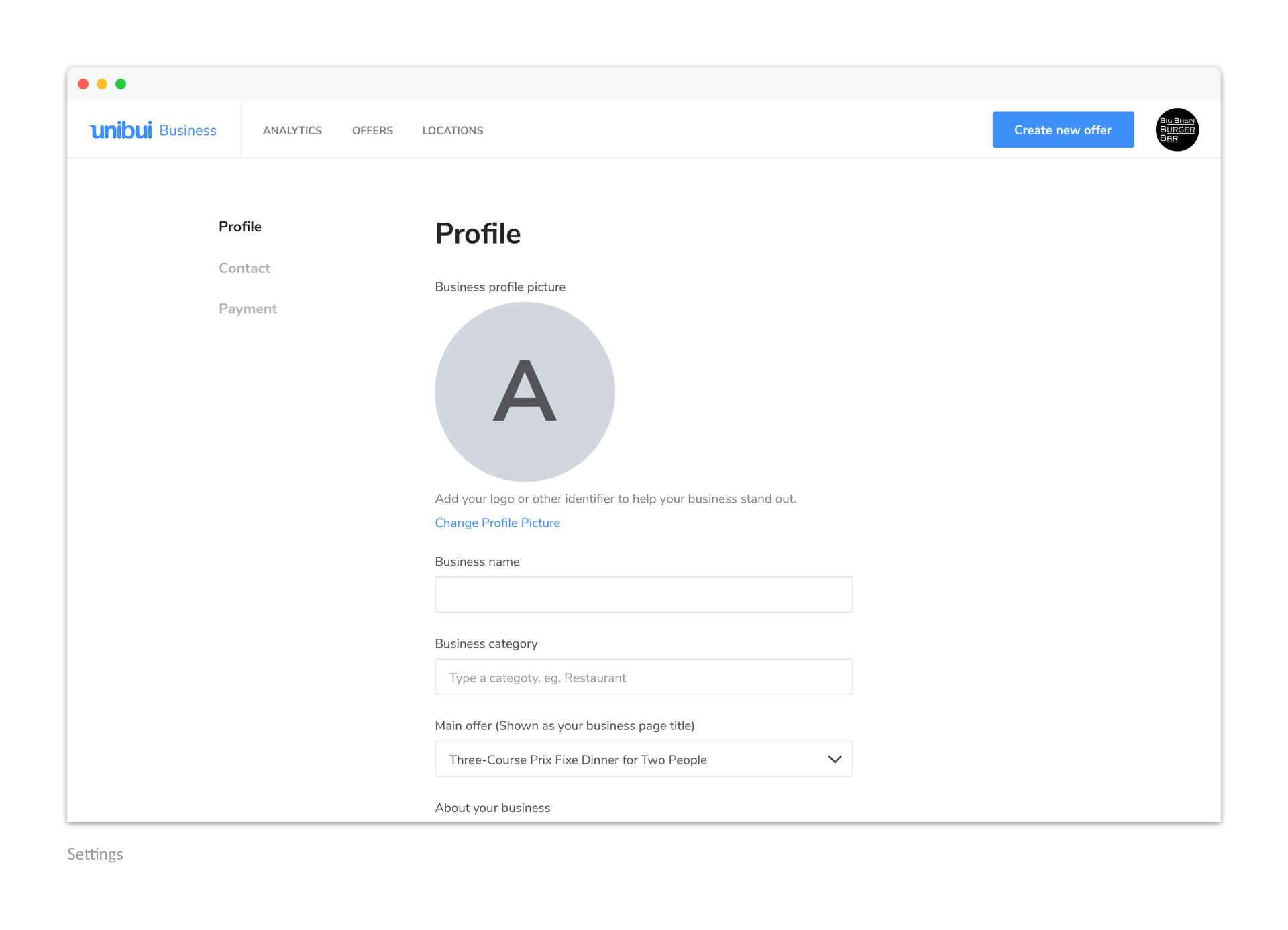
Everything About the Account
We put the entrances of everything else about the account into the menu behind the user avatar in nav bar, including Claim history, reviews, settings, and payments.
Onboard Business Users
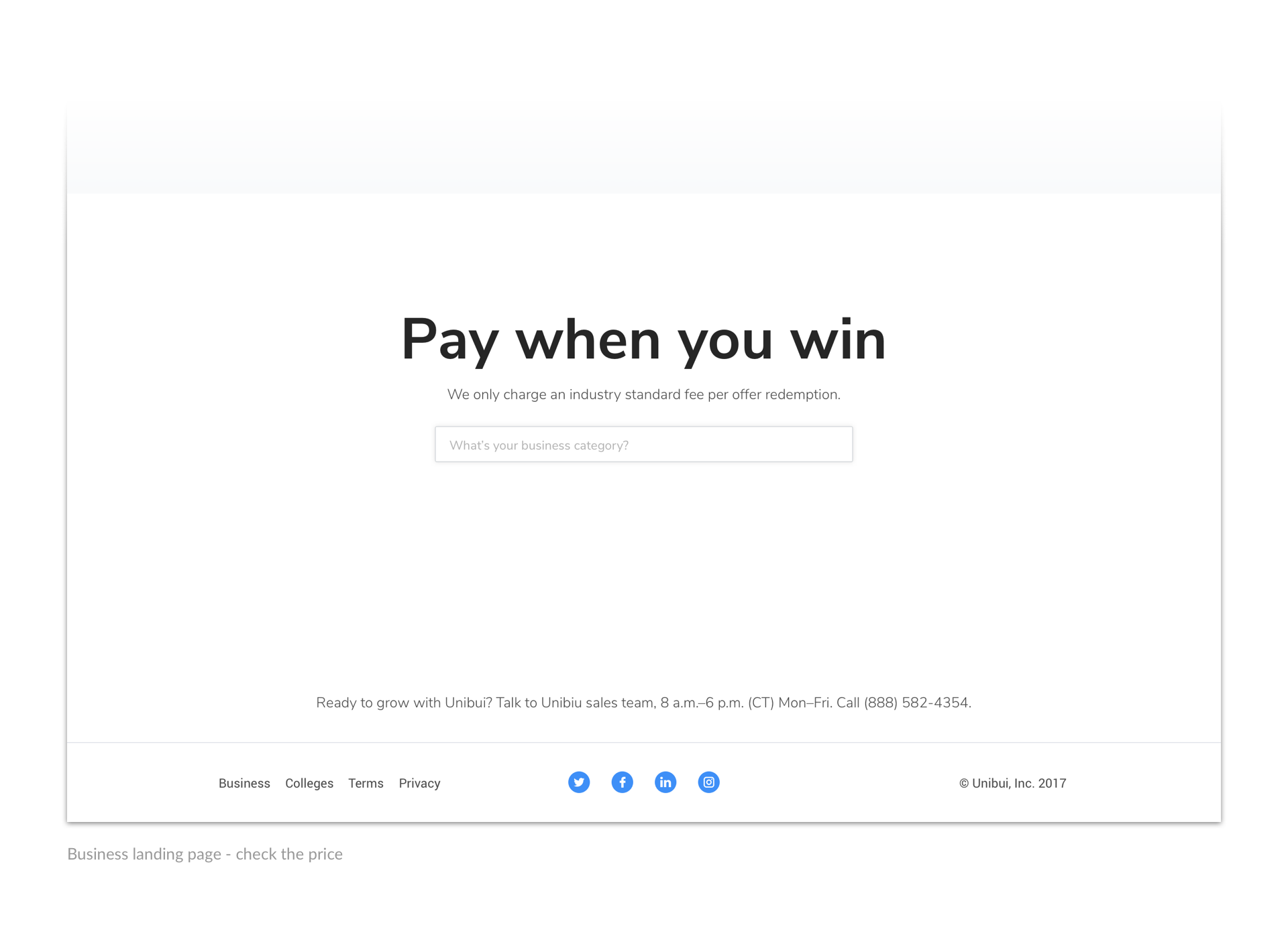
After finishing most parts inside the platform, we turned back to design the business site landing page. The landing page should serve as our billboard and lead the business owners to the signup or login process.
We organized the landing page contents in a logical order to make them more understandable and intriguing. After introducing how Unibui works, the benefits of Unibui, and how to enroll in Unibui, we put a pricing section as the last part.
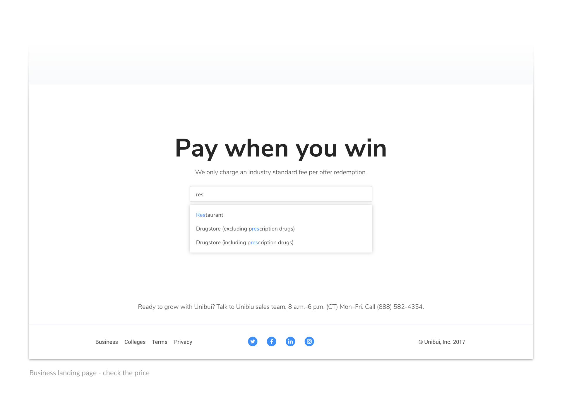
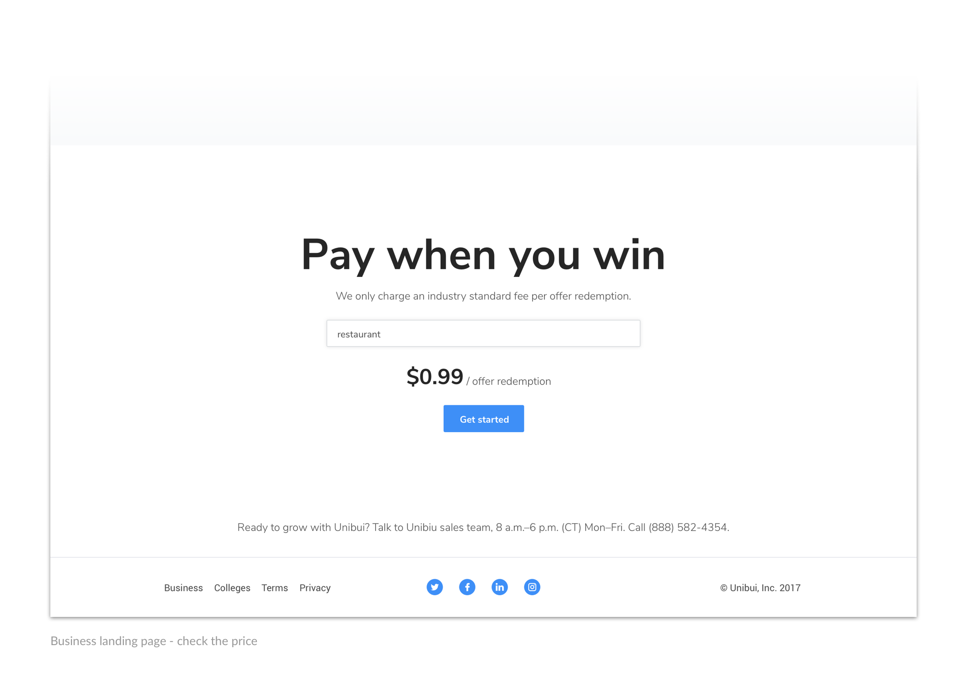
An autocomplete search bar was placed in the pricing section for users to check the fee we charge for their specific industry. After typing and searching for their business category, the fee will be shown in an eye-catching big bold font, followed by another signup button ready to lead them to the registration flow.
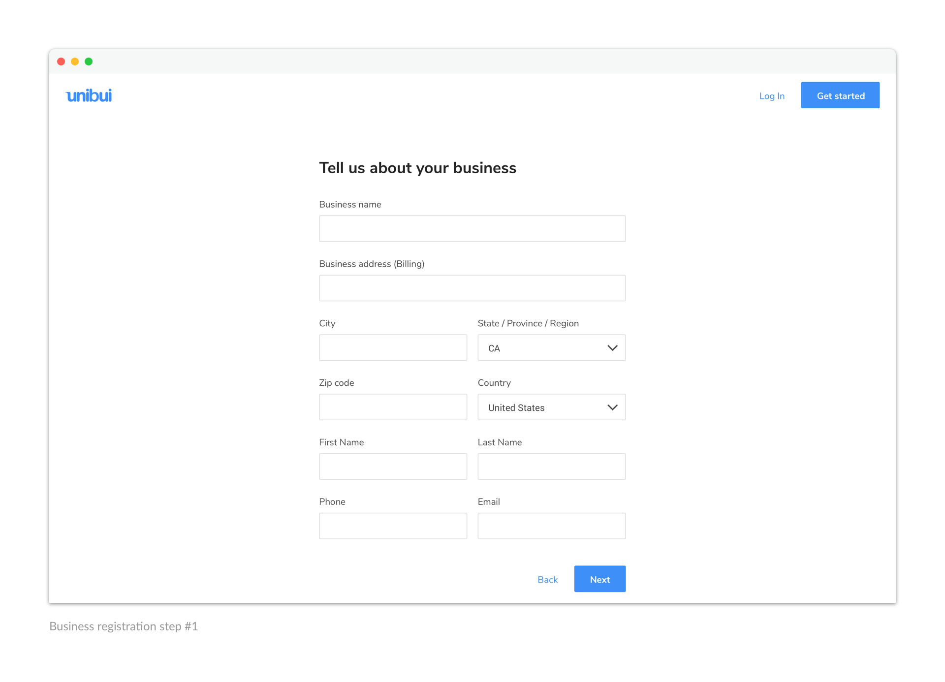
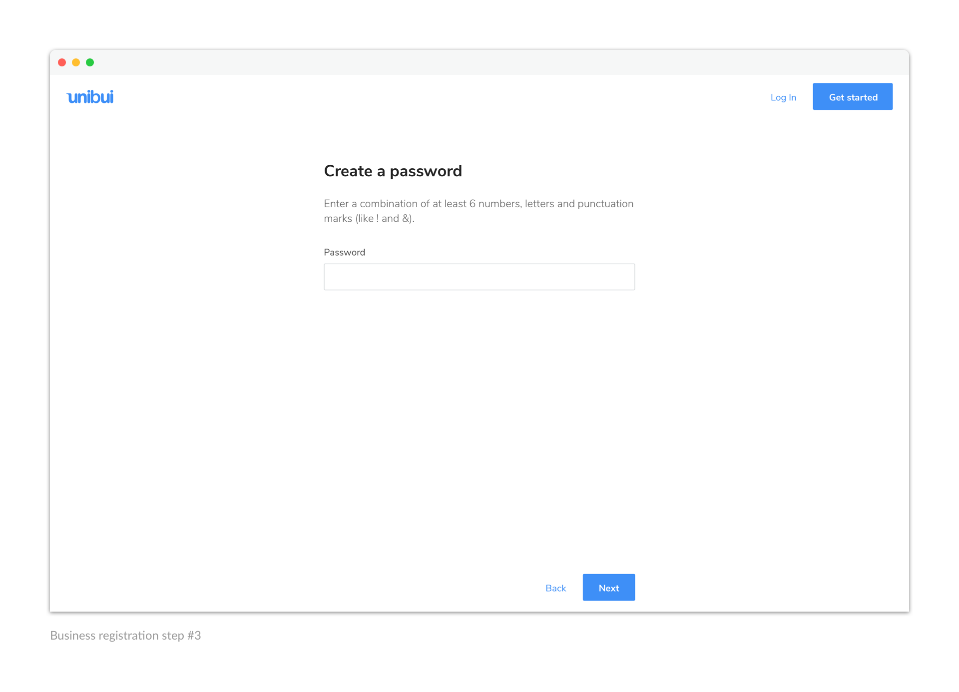
From the landing page, we lead our potential users to a seamless registration flow. We ask about their business in a friendly and gentle way and assist them on creating their first offer on Unibui.
Browse the following gallery to check the registration flow:

Results
Unibui Business has been a simple way for business owners to learn about and get on Unibui platform, as well as manage their business promotions. In that regard I am very pleased with its pereformance so far.
In this project I designed a relatively "lightweight" business management tool on which I had limited experience before. So I had to do research on business owners I was designing for and learn new design patterns. Besides these specifc knowledges, I gained experience and extracted some tips on how to cut into and design for a whole new field, which could be valuable in my future career.
Selected Works

LENOVO MOBILE APPProject type
UNIBUI MOBILE APPProject type

UNIBUI ANALYTICSProject type

UNIBUI BUSINESSProject type

UNIBUIProject type

COLGATE INNOVATION PORTALProject type